Mike's Notes
Another excellent resource about using ARIA.
Resources
- https://www.smashingmagazine.com/2025/06/what-i-wish-someone-told-me-aria/
- https://www.smashingmagazine.com/author/eric-bailey/
- https://webaim.org/articles/visual/blind#screenreaders
- https://webaim.org/articles/motor/assistive#voicerecognition
- https://www.w3.org/TR/wai-aria/#introstates
- https://html.spec.whatwg.org/multipage/form-elements.html#the-button-element
- https://w3c.github.io/aria/#host_general_attrs
- https://www.w3.org/TR/2006/WD-aria-role-20060926/
- https://www.w3.org/TR/wai-aria-1.2/
- https://www.craigabbott.co.uk/blog/a-look-at-the-new-wai-aria-1-3-draft/
- https://www.w3.org/WAI/
- https://www.w3.org/
- https://en.wikipedia.org/wiki/Windows_XP
- https://jquerymobile.com/
- https://en.wikipedia.org/wiki/Ajax_(programming)
- https://github.blog/engineering/user-experience/considerations-for-making-a-tree-view-component-accessible/#start-with-windows
- https://www.w3.org/TR/wai-aria-1.3/
- https://open-ui.org/
- https://github.com/w3c/aria/
- https://www.w3.org/TR/using-aria/#NOTES
- https://www.w3.org/TR/using-aria/#firstrule
- https://www.w3.org/TR/using-aria/#secondrule
- https://www.w3.org/TR/using-aria/#3rdrule
- https://www.w3.org/TR/using-aria/#4thrule
- https://www.w3.org/TR/using-aria/#fifthrule
- https://www.w3.org/TR/wai-aria/#roles_categorization
- https://www.w3.org/TR/wai-aria/#abstract_roles
- https://en.wiktionary.org/wiki/supercategory
- https://www.w3.org/TR/wai-aria/#listitem
- https://www.w3.org/TR/wai-aria/#list
- https://www.w3.org/TR/wai-aria/#role_definitions
- https://www.w3.org/TR/wai-aria/#introstates
- https://www.w3.org/TR/wai-aria/#dfn-managed-state
- https://developer.mozilla.org/en-US/docs/Web/HTML/Attributes
- https://w3c.github.io/aria/#aria-live
- https://www.a11yproject.com/posts/aria-has-perfect-support/
- https://hidde.blog/
- https://hidde.blog/boolean-attributes-in-html-and-aria-whats-the-difference/
- https://www.freecodecamp.org/news/stateful-vs-stateless-architectures-explained/
- https://w3c.github.io/aria/#aria-expanded
- https://html.spec.whatwg.org/multipage/interaction.html#the-hidden-attribute
- https://www.smashingmagazine.com/2021/05/accessible-svg-patterns-comparison/
- https://www.w3.org/WAI/tutorials/images/decorative/
- https://www.w3.org/WAI/ARIA/apg/patterns/landmarks/examples/HTML5.html
- https://www.w3.org/html/logo/
- https://developer.mozilla.org/en-US/docs/Web/CSS/border-radius
- https://www.smashingmagazine.com/2025/06/what-i-wish-someone-told-me-aria/#the-more-aria-you-add-to-something-the-greater-the-chance-something-will-behave-unexpectedly
- https://w3c.github.io/aria/#aria-label
- https://theideaplace.net/tooltip-should-not-start-an-accessible-name/
- https://www.nngroup.com/articles/mega-menus-work-well/
- https://w3c.github.io/aria/#menu
- https://www.w3.org/TR/wai-aria/#role_definitions
- https://www.w3.org/TR/wai-aria-1.2/#namefromprohibited
- https://www.w3.org/WAI/about/groups/ariawg/
- https://ericwbailey.website/published/it-needs-to-map-back-to-a-role/#edicts-still-need-to-be-carried-out
- https://webaim.org/articles/nvda/
- https://webaim.org/articles/screenreader_testing/
- https://www.w3.org/TR/wai-aria/#introstates
- https://www.afb.org/node/16207/refreshable-braille-displays
- https://developer.mozilla.org/en-US/docs/Web/API/Element/click_event
- https://adrianroselli.com/2022/04/brief-note-on-buttons-enter-and-space.html
- https://html.spec.whatwg.org/multipage/grouping-content.html#the-div-element
- https://html5doctor.com/
- https://developer.mozilla.org/en-US/docs/Web/HTML/Global_attributes
- https://w3c.github.io/aria/#aria-describedby
- https://w3c.github.io/aria/#aria-posinset
- https://www.w3.org/TR/wai-aria/#state_prop_def
- https://www.deque.com/axe/
- https://wave.webaim.org/
- https://www.tpgi.com/arc-platform/arc-toolkit/
- https://pa11y.org/
- https://github.com/IBMa/equal-access#equal-access
- https://en.wikipedia.org/wiki/Continuous_integration
- https://www.w3.org/TR/wai-aria/#dfn-accessibility-tree
- https://css-tricks.com/accessibility-events/
- https://accessaces.com/what-disabled-people-have-to-give-up-in-the-name-of-accessibility/
- https://www.webstandards.org/
- https://www.w3.org/standards/
- https://aria-at.w3.org/
- https://caniuse.com/
- https://web.dev/baseline
- https://webstatus.dev/
- https://a11ysupport.io/
- https://www.smashingmagazine.com/2018/09/importance-manual-accessibility-testing/
- https://alistapart.com/article/semantics-to-screen-readers/
- https://support.apple.com/guide/voiceover/get-started-vo4be8816d70/10/mac/15.0
- https://www.freedomscientific.com/products/software/jaws/
- https://github.com/FreedomScientific/standards-support/issues
- https://stimpunks.org/glossary/crip-tax/
- https://www.un.org/development/desa/disabilities/resources/factsheet-on-persons-with-disabilities/disability-and-employment.html
- https://dom.spec.whatwg.org/
- https://webaim.org/projects/million/#aria
- https://quandyfactory.com/blog/39/the_virtue_of_forgiving_html_parsers
- https://benmyers.dev/blog/dont-use-aria-label-on-static-text-elements/
- https://adrianroselli.com/2019/11/aria-label-does-not-translate.html
- https://ericwbailey.website/published/what-they-dont-tell-you-when-you-translate-your-app/#you%E2%80%99ll-need-to-translate-%2F-localize-more-than-you-think-you-will
- https://www.w3.org/WAI/WCAG21/Understanding/label-in-name.html
- https://adrianroselli.com/2019/10/stop-giving-control-hints-to-screen-readers.html
- https://ericwbailey.website/published/aria-label-is-a-code-smell/
- https://w3c.github.io/aria/#aria-live
- https://tetralogical.com/blog/2024/05/01/why-are-my-live-regions-not-working/
- https://www.w3.org/WAI/ARIA/apg/
- https://www.w3.org/WAI/ARIA/apg/patterns/
- https://adrianroselli.com/2023/04/no-apgs-support-charts-are-not-can-i-use-for-aria.html
- https://www.w3.org/WAI/ARIA/apg/patterns/listbox/#keyboardinteraction
- https://en.wikipedia.org/wiki/Typeahead
- https://github.blog/engineering/user-experience/considerations-for-making-a-tree-view-component-accessible/#start-with-windows
- https://www.w3.org/WAI/ARIA/apg/patterns/
- https://adrianroselli.com/2020/03/stop-using-drop-down.html
- https://support.apple.com/guide/voiceover/welcome/mac
- https://www.applevis.com/forum/macos-mac-apps/state-screen-readers-macos
- https://www.apple.com/visionos/visionos-2/
- https://www.virtualbox.org/
- https://www.microsoft.com/en-us/evalcenter/evaluate-windows-11-enterprise
- https://assistivlabs.com/
- https://support.apple.com/guide/iphone/turn-on-and-practice-voiceover-iph3e2e415f/ios
- https://webaim.org/projects/screenreadersurvey10/#mobileplatforms
- https://tink.uk/using-the-aria-current-attribute/
- https://css-tricks.com/user-facing-state/
- https://developer.mozilla.org/en-US/docs/Web/CSS/:has
- https://developer.chrome.com/docs/web-platform/view-transitions
- https://en.wikipedia.org/wiki/Software_testing
- https://camchenry.com/blog/how-i-write-accessible-playwright-tests
- https://playwright.dev/
- https://adrianroselli.com/
- https://janmaarten.com/
References
Repository
-
Home > Ajabbi Research > Library > Subscriptions > Smashing Magazine
-
Home > Handbook >
Last Updated
22/06/2025
What I Wish Someone Told Me When I Was Getting Into ARIA
By: Eric Bailey
Smashing Magazine: 16/06/2025
Eric is a Boston-based designer who helps create straightforward solutions that address a person’s practical, physical, cognitive, and emotional needs.
If you haven’t encountered ARIA before, great! It’s a chance to learn something new and exciting. If you have heard of ARIA before, this might help you better understand it or maybe even teach you something new!
These are all things I wish someone had told me when I was getting started on my web accessibility journey. This post will:
- Provide a mindset for how to approach ARIA as a concept,
- Debunk some common misconceptions, and
- Provide some guiding thoughts to help you better understand and work with it.
It is my hope that in doing so, this post will help make an oft-overlooked yet vital corner of web design and development easier to approach.
What This Post Is Not
This is not a recipe book for how to use ARIA to build accessible websites and web apps. It is also not a guide for how to remediate an inaccessible experience. A lot of accessibility work is highly contextual. I do not know the specific needs of your project or organization, so trying to give advice here could easily do more harm than good.
Instead, think of this post as a “know before you go” guide. I’m hoping to give you a good headspace to approach ARIA, as well as highlight things to watch out for when you undertake your journey. So, with that out of the way, let’s dive in!
So, What Is ARIA?
ARIA is what you turn to if there is not a native HTML element or attribute that is better suited for the job of communicating interactivity, purpose, and state.
Think of it like a spice that you sprinkle into your markup to enhance things.
Adding ARIA to your HTML markup is a way to provide additional information to a website or web application for screen readers and voice control software.
- Interactivity means the content can be activated or manipulated. An example of this is navigating to a link’s destination.
- Purpose means what something is used for. An example of this is a text input used to collect someone’s name.
- State means the current status content has been placed in and controlled by states, properties, and values. An example of this is an accordion panel that can either be expanded or collapsed.
Here is an illustration to help communicate what I mean by this:
Three panels, showing a pressed-in mute button, its underlying HTML code, and three labels for “Interactivity,” “Purpose,” and “State.” The button element uses the “Interactivity” label. A declaration of aria-pressed equals true uses the “State” label. And finally, the button’s string value of “Mute” uses the “Purpose” label. The button’s HTML also uses a visually hidden CSS class to hide the string, then a decorative SVG icon to show a speaker mute icon.

(Large preview)The presence of HTML’s button element will instruct assistive technology to report it as a button, letting someone know that it can be activated to perform a predefined action.
The presence of the text string “Mute” will be reported by assistive technology to clue the person into what the button is used for.
The presence of aria-pressed="true" means that someone or something has previously activated the button, and it is now in a “pushed in” state that sustains its action.
This overall pattern will let people who use assistive technology know:
- If something is interactive,
- What kind of interactive behavior it performs, and
- Its current state.
ARIA’s History
ARIA has been around for a long time, with the first version published on September 26th, 2006.
The Roles for Accessible Rich Internet Applications (WAI-ARIA Roles) specification, loaded in a copy of Internet Explorer 7.

(Large preview)
ARIA was created to provide a bridge between the limitations of HTML and the need for making interactive experiences understandable by assistive technology.
“
The latest version of ARIA is version 1.2, published on June 6th, 2023. Version 1.3 is slated to be released relatively soon, and you can read more about it in this excellent article by Craig Abbott.
You may also see it referred to as WAI-ARIA, where WAI stands for “Web Accessibility Initiative.” The WAI is part of the W3C, the organization that sets standards for the web. That said, most accessibility practitioners I know call it “ARIA” in written and verbal communication and leave out the “WAI-” part.
The Spirit Of ARIA Reflects The Era In Which It Was Created
The reason for this is simple: The web was a lot less mature in the past than it is now. The most popular operating system in 2006 was Windows XP. The iPhone didn’t exist yet; it was released a year later.
From a very high level, ARIA is a snapshot of the operating system interaction paradigms of this time period. This is because ARIA recreates them.
Windows XP, showing an open Start menu, the famous Rolling Green Hills desktop wallpaper, and a tooltip popping up from the taskbar advising us to take a tour of Windows XP. Screenshot.

Image source: The Microsoft Windows XP Wiki. (Large preview)
The Mindset
Smartphones with features like tappable, swipeable, and draggable surfaces were far less commonplace. Single Page Application “web app” experiences were also rare, with Ajax-based approaches being the most popular. This means that we have to build the experiences of today using the technology of 2006. In a way, this is a good thing. It forces us to take new and novel experiences and interrogate them.
Interactions that cannot be broken down into smaller, more focused pieces that map to ARIA patterns are most likely inaccessible. This is because they won’t be able to be operated by assistive technology or function on older or less popular devices.
I may be biased, but I also think these sorts of novel interactions that can’t translate also serve as a warning that a general audience will find them to be confusing and, therefore, unusable. This belief is important to consider given that the internet serves:
- An unknown number of people,
- Using an unknown number of devices,
- Each with an unknown amount of personal customizations,
- Who have their own unique needs and circumstances and
- Have unknown motivational factors.
Interaction Expectations
Contemporary expectations for keyboard-based interaction for web content — checkboxes, radios, modals, accordions, and so on — are sourced from Windows XP and its predecessor operating systems. These interaction models are carried forward as muscle memory for older people who use assistive technology. Younger people who rely on assistive technology also learn these de facto standards, thus continuing the cycle.
What does this mean for you? Someone using a keyboard to interact with your website or web app will most likely try these Windows OS-based keyboard shortcuts first. This means things like pressing:
- Enter to navigate to a link’s destination,
- Space to activate buttons,
- Home and End to jump to the start or end of a list of items, and so on.
It’s Also A Living Document
This is not to say that ARIA has stagnated. It is constantly being worked on with new additions, removals, and clarifications. Remember, it is now at version 1.2, with version 1.3 arriving soon.
In parallel, HTML as a language also reflects this evolution. Elements were originally created to support a document-oriented web and have been gradually evolving to support more dynamic, app-like experiences. The great bit here is that this is all conducted in the open and is something you can contribute to if you feel motivated to do so.
ARIA Has Rules For Using It
There are five rules included in ARIA’s documentation to help steer how you approach it:
- Use a native element whenever possible.
An example would be using an anchor element (<a>) for a link rather than a div with a click handler and a role of link.
- Don’t adjust a native element’s semantics if at all possible.
An example would be trying to use a heading element as a tab rather than wrapping the heading in a semantically neutral div.
- Anything interactive has to be keyboard operable.
If you can’t use it with a keyboard, it isn’t accessible. Full stop.
- Do not use role="presentation" or aria-hidden="true" on a focusable element.
This makes something intended to be interactive unable to be used by assistive technology.
- Interactive elements must be named.
An example of this is using the text string “Print” for a button element.
Observing these five rules will do a lot to help you out. The following is more context to provide even more support.
ARIA Has A Taxonomy
There is a structured grammar to ARIA, and it is centered around roles, as well as states and properties.
Roles
A Role is what assistive technology reads and then announces. A lot of people refer to this in shorthand as semantics. HTML elements have implied roles, which is why an anchor element will be announced as a link by screen readers with no additional work.
Three panels, showing how an implied role gets announced by assistive technology. The first panel shows an anchor element with a string value of “French fries.” The anchor element has the label “Implied link role.” The second panel shows a standard blue link with an underline. The link reads, “French fries.” The third panel shows a speech balloon coming from a laptop. The speech balloon’s contents read, “French fries, link.” A label points to the speech balloon and reads, “Implied link role.”

(Large preview)
Implied roles are almost always better to use if the use case calls for them. Recall the first rule of ARIA here. This is usually what digital accessibility practitioners refer to when they say, “Just use semantic HTML.”
There are many reasons for favoring implied roles. The main consideration is better guarantees of support across an unknown number of operating systems, browsers, and assistive technology combinations.
Roles have categories, each with its own purpose. The Abstract role category is notable in that it is an organizing supercategory not intended to be used by authors:
Abstract roles are used for the ontology. Authors MUST NOT use abstract roles in content.
<!-- This won't work, don't do it -->
<h2 role="sectionhead">
Anatomy and physiology
</h2>
<!-- Do this instead -->
<section aria-labeledby="anatomy-and-physiology">
<h2 id="anatomy-and-physiology">
Anatomy and physiology
</h2>
</section>
Additionally, in the same way, you can only declare ARIA on certain things, you can only declare some ARIA as children of other ARIA declarations. An example of this is the the listitem role, which requires a role of list to be present on its parent element.
So, what’s the best way to determine if a role requires a parent declaration? The answer is to review the official definition.
States And Properties
States and properties are the other two main parts of ARIA‘s overall taxonomy.
Implicit roles are provided by semantic HTML, and explicit roles are provided by ARIA. Both describe what an element is. States describe that element’s characteristics in a way that assistive technology can understand. This is done via property declarations and their companion values.
A code example that shows how roles, states, and properties all work together. The first panel shows HTML code for a button element, which uses an ARIA declaration of aria disabled equals true. The button element is labeled as “Role”. The ARIA declaration, including both the property and value portions, is labeled “State.”

(Large preview)ARIA states can change quickly or slowly, both as a result of human interaction as well as application state. When the state is changed as a result of human interaction, it is considered an “unmanaged state.” Here, a developer must supply the underlying JavaScript logic to control the interaction.
When the state changes as a result of the application (e.g., operating system, web browser, and so on), this is considered “managed state.” Here, the application automatically supplies the underlying logic.
How To Declare ARIA
Think of ARIA as an extension of HTML attributes, a suite of name/value pairs. Some values are predefined, while others are author-supplied:
Two HTML declarations. One is a div element with an ARIA declaration of aria-live equals polite declared on it. The second is a button element with an ARIA declaration of aria-label equals save. The aria-live declaration is labeled “Predefined value,” and the aria-label declaration is labeled “Author-supplied value.”
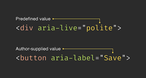
(Large preview)For the examples in the previous graphic, the polite value for aria-live is one of the three predefined values (off, polite, and assertive). For aria-label, “Save” is a text string manually supplied by the author.
You declare ARIA on HTML elements the same way you declare other attributes:
<!--
Applies an id value of
"carrot" to the div
-->
<div id="carrot"></div>
<!--
Hides the content of this paragraph
element from assistive technology
-->
<p aria-hidden="true">
Assistive technology can't read this
</p>
<!--
Provides an accessible name of "Stop",
and also communicates that the button
is currently pressed. A type property
with a value of "button" prevents
browser form submission.
-->
<button
aria-label="Stop"
aria-pressed="true"
type="button">
<!-- SVG icon -->
</button>
Other usage notes:
You can place more than one ARIA declaration on an HTML element.
The order of placement of ARIA when declared on an HTML element does not matter.
There is no limit to how many ARIA declarations can be placed on an element. Be aware that the more you add, the more complexity you introduce, and more complexity means a larger chance things may break or not function as expected.
You can declare ARIA on an HTML element and also have other non-ARIA declarations, such as class or id. The order of declarations does not matter here, either.
It might also be helpful to know that boolean attributes are treated a little differently in ARIA when compared to HTML. Hidde de Vries writes about this in his post, “Boolean attributes in HTML and ARIA: what’s the difference?”.
Not A Whole Lot Of ARIA Is “Hardcoded”
In this context, “hardcoding” means directly writing a static attribute or value declaration into your component, view, or page.
A lot of ARIA is designed to be applied or conditionally modified dynamically based on application state or as a response to someone’s action. An example of this is a show-and-hide disclosure pattern:
ARIA’s aria-expanded attribute is toggled from false to true to communicate if the disclosure is in an expanded or collapsed state.
HTML’s hidden attribute is conditionally removed or added in tandem to show or hide the disclosure’s full content area.
<div class="disclosure-container">
<button
aria-expanded="false"
class="disclosure-toggle"
type="button">
How we protect your personal information
</button>
<div
hidden
class="disclosure-content">
<ul>
<li>Fast, accurate, thorough and non-stop protection from cyber attacks</li>
<li>Patching practices that address vulnerabilities that attackers try to exploit</li>
<li>Data loss prevention practices help to ensure data doesn't fall into the wrong hands</li>
<li>Supply risk management practices help ensure our suppliers adhere to our expectations</li>
</ul>
<p>
<a href="/security/">Learn more about our security best practices</a>.
</p>
</div>
</div>
A common example of a hardcoded ARIA declaration you’ll encounter on the web is making an SVG icon inside a button decorative:
<button type="button>
<svg aria-hidden="true">
<!-- SVG code -->
</svg>
Save
</button>
Here, the string “Save” is what is required for someone to understand what the button will do when they activate it. The accompanying icon helps that understanding visually but is considered redundant and therefore decorative.
Declaring An Aria Role On Something That Already Uses That Role Implicitly Does Not Make It “Extra” Accessible
An implied role is all you need if you’re using semantic HTML. Explicitly declaring its role via ARIA does not confer any additional advantages.
<!--
You don't need to declare role="button" here.
Using the <button> element will make assistive
technology announce it as a button. The
role="button" declaration is redundant.
-->
<button role="button">
Save
</button>
You might occasionally run into these redundant declarations on HTML sectioning elements, such as <main role="main">, or <footer role="contentinfo">. This isn’t needed anymore, and you can just use the <main> or <footer> elements.
The reason for this is historic. These declarations were done for support reasons, in that it was a stop-gap technique for assistive technology that needed to be updated to support these new-at-the-time HTML elements.
Contemporary assistive technology does not need these redundant declarations. Think of it the same way that we don’t have to use vendor prefixes for the CSS border-radius property anymore.
Note: There is an exception to this guidance. There are circumstances where certain complex and complicated markup patterns don’t work as expected for assistive technology. In these cases, we want to hardcode the implicit role as explicit ARIA to ensure it works. This assistive technology support concern is covered in more detail later in this post.
You Don’t Need To Say What A Control Is; That Is What Roles Are For
Both implicit and explicit roles are announced by screen readers. You don’t need to include that part for things like the interactive element’s text string or an aria-label.
<!-- Don't do this -->
<button
aria-label="Save button"
type="button">
<!-- Icon SVG -->
</button>
<!-- Do this instead -->
<button
aria-label="Save"
type="button">
<!-- Icon SVG -->
</button>
Had we used the string value of “Save button” for our Save button, a screen reader would announce it along the lines of, “Save button, button.” That’s redundant and confusing.
ARIA Roles Have Very Specific Meanings
We sometimes refer to website and web app navigation colloquially as menus, especially if it’s an e-commerce-style mega menu.
In ARIA, menus mean something very specific. Don’t think of global or in-page navigation or the like. Think of menus in this context as what appears when you click the Edit menu button on your application’s menubar.
The edit menu option activated on Windows Notepad. It shows a list of menu options, with the option for “Go to” being in focus. Some options are disabled, as there is no content in the Notepad file, nor is there anything on the Windows Clipboard. The other menu options are Undo, Cut, Copy, Paste, Delete, Search with Bing, Find, Find Next, Find Previous, Replace, Select All, Time/Date, and Font. Screenshot.

Notepad, Windows 11. (Large preview)Using a role improperly because its name seems like an appropriate fit at first glance creates confusion for people who do not have the context of the visual UI. Their expectations will be set with the announcement of the role, then subverted when it does not act the way it is supposed to.
Imagine if you click on a link, and instead of taking you to another webpage, it sends something completely unrelated to your printer instead. It’s sort of like that.
Declaring role="menu" is a common example of a misapplied role, but there are others. The best way to know what a role is used for? Go straight to the source and read up on it.
Certain Roles Are Forbidden From Having Accessible Names
These roles are caption, code, deletion, emphasis, generic, insertion, paragraph, presentation, strong, subscript, and superscript.
This means you can try and provide an accessible name for one of these elements — say via aria-label — but it won’t work because it’s disallowed by the rules of ARIA’s grammar.
<!-- This won't work-->
<strong aria-label="A 35% discount!">
$39.95
</strong>
<!-- Neither will this -->
<code title="let JavaScript example">
let submitButton = document.querySelector('button[type="submit"]');
</code>
For these examples, recall that the role is implicit, sourced from the declared HTML element.
Note here that sometimes a browser will make an attempt regardless and overwrite the author-specified string value. This overriding is a confusing act for all involved, which led to the rule being established in the first place.
You Can’t Make Up ARIA And Expect It To Work
I’ve witnessed some developers guess-adding CSS classes, such as .background-red or .text-white, to their markup and being rewarded if the design visually updates correctly.
The reason this works is that someone previously added those classes to the project. With ARIA, the people who add the content we can use are the Accessible Rich Internet Applications Working Group. This means each new version of ARIA has a predefined set of properties and values. Assistive technology is then updated to parse those attributes and values, although this isn’t always a guarantee.
Declaring ARIA, which isn’t part of that predefined set, means assistive technology won’t know what it is and consequently won’t announce it.
<!--
There is no "selectpanel" role in ARIA.
Because of this, this code will be announced
as a button and not as a select panel.
-->
<button
role="selectpanel"
type="button">
Choose resources
</button>
ARIA Fails Silently
This speaks to the previous section, where ARIA won’t understand words spoken to it that exist outside its limited vocabulary.
There are no console errors for malformed ARIA. There’s also no alert dialog, beeping sound, or flashing light for your operating system, browser, or assistive technology. This fact is yet another reason why it is so important to test with actual assistive technology.
You don’t have to be an expert here, either. There is a good chance your code needs updating if you set something to announce as a specific state and assistive technology in its default configuration does not announce that state.
ARIA Only Exposes The Presence Of Something To Assistive Technology
Applying ARIA to something does not automatically “unlock” capabilities. It only sends a hint to assistive technology about how the interactive content should behave.
For assistive technology like screen readers, that hint could be for how to announce something. For assistive technology like refreshable Braille displays, it could be for how it raises and lowers its pins. For example, declaring role="button" on a div element does not automatically make it clickable. You will still need to:
- Target the div element in JavaScript,
- Tie it to a click event,
- Author the interactive logic that it performs when clicked, and then
- Accommodate all the other expected behaviors.
This all makes me wonder why you can’t save yourself some work and use a button element in the first place, but that is a different story for a different day.
Additionally, adjusting an element’s role via ARIA does not modify the element’s native functionality. For example, you can declare role="image" on a div element. However, attempting to declare the alt or src attributes on the div won’t work. This is because alt and src are not supported attributes for div.
Two panels, one labeled “Will work” and the other labeled, “Won’t work.” The panel labeled “Will work” shows an image element with an alt and src attribute. The panel labeled “Won’t work” shows a div with a role of image, as well as alt and src attributes. Both src attributes link to a file called cucumber.jpg, and both alt attributes use a string value of “A small cucumber.”
[IMG]
(Large preview)
Declaring an ARIA Role On Something Will Override Its Semantics, But Not Its Behavior
This speaks to the previous section on ARIA only exposing something’s presence. Don’t forget that certain HTML elements have primary and secondary interactive capabilities built into them.
For example, an anchor element’s primary capability is navigating to whatever URL value is provided for its href attribute. Secondary capabilities for an anchor element include copying the URL value, opening it in a new tab or incognito window, and so on.
A link whose string value is “Link with a role set to button.” Above it is text that reads, “For demonstration purposes only. Please don’t do this.” The link has a cursor placed over it, with an active right-click menu. The menu shows multiple actions you can take on the link, including opening it in a new tab or window, copying and saving the link address, searching the web for the link’s string value, as well as options provided by user-installed browser extensions. These options are managing the link with the 1Password password manager and copying a link to the selected text. Cropped screenshot.
[IMG]
Chrome on macOS. Note the support for user-installed browser extensions. (Large preview)
These secondary capabilities are still preserved. However, it may not be apparent to someone that they can use them — or use them in the way that they’d expect — depending on what is announced.
The opposite is also true. When an element has no capabilities, having its role adjusted does not grant it any new abilities. Remember, ARIA only announces. This is why that div with a role of button assigned to it won’t do anything when clicked if no companion JavaScript logic is also present.
Two side-by-side graphics, each one consisting of three panels. The first panel on the left of the graphic shows the HTML code for a button element. The first panel for the right graphic shows HTML code for a div with a role of button. Both examples use a string value of “Favorite” and have a class of “button-fav” applied to them. The second panel for both left and right graphics shows an identical-looking button labeled “Favorite”, which has a golden-colored background. The third panel for the left graphic shows support for Enter and Space keypresses. The third panel for the right graphic shows no support for Enter and Space keypresses.
[IMG]
(Large preview)
You Will Need To Declare ARIA To Make Certain Interactions Accessible
A lot of the previous content may make it seem like ARIA is something you should avoid using altogether. This isn’t true. Know that this guidance is written to help steer you to situations where HTML does not offer the capability to describe an interaction out of the box. This space is where you want to use ARIA.
Knowing how to identify this area requires spending some time learning what HTML elements there are, as well as what they are and are not used for. I quite like HTML5 Doctor’s Element Index for upskilling on this.
Certain ARIA States Require Certain ARIA Roles To Be Present
This is analogous to how HTML has both global attributes and attributes that can only be used on a per-element basis. For example, aria-describedby can be used on any HTML element or role. However, aria-posinset can only be used with article, comment, listitem, menuitem, option, radio, row, and tab roles. Remember here that these roles can be provided by either HTML or ARIA.
Learning what states require which roles can be achieved by reading the official reference. Check for the “Used in Roles” portion of each entry’s characteristics:
A characteristics table for aria setsize. The table’s two columns are labeled “Characteristic” and “Value.” The second table row is highlighted, demonstrating where you look for what role supports what state. The First row’s first cell has the text, “Used in roles.” The first row’s second cell has the text, “article, listitem, menuitem, option, radio, row, tab.” The second row’s first cell has the text, “Inherits into Roles.” The second row’s second cell has the text, “menuitemcheckbox, menuitemradio, treeitem.” The third row’s first cell has the text “Value.” Cropped screenshot.
[IMG]
Characteristics for aria-setsize. (Large preview)
Automated code scanners — like axe, WAVE, ARC Toolkit, Pa11y, equal-access, and so on — can catch this sort of thing if they are written in error. I’m a big fan of implementing these sorts of checks as part of a continuous integration strategy, as it makes it a code quality concern shared across the whole team.
ARIA Is More Than Web Browsers
Speaking of technology that listens, it is helpful to know that the ARIA you declare instructs the browser to speak to the operating system the browser is installed on. Assistive technology then listens to what the operating system reports. It then communicates that to the person using the computer, tablet, smartphone, and so on.
A flowchart with four steps. The first step is a webpage with a code icon floating above it. The second step is a computer, with an icon of an indented list floating above it. The third step is the symbol for accessibility, a Vitruvian man in a circle. Above this icon is a speech bubble. The fourth and final step is a person, with an icon of a lit lightbulb floating above it.
[IMG]
(Large preview)
A person can then instruct assistive technology to request the operating system to take action on the web content displayed in the browser.
A flowchart with four steps. The first step is a person with an icon of a finger pressing a button floating above it. The second step is the symbol for accessibility, a Vitruvian man in a circle. Above this icon is a speech bubble. The third step is a computer, with an icon of a handshake floating above it. The fourth and final step is an updated webpage, with a clicking mouse cursor icon floating above it.
[IMG]
(Large preview)
This interaction model is by design. It is done to make interaction from assistive technology indistinguishable from interaction performed without assistive technology.
There are a few reasons for this approach. The most important one is it helps preserve the privacy and autonomy of the people who rely on assistive technologies.
Just Because It Exists In The ARIA Spec Does Not Mean Assistive Technology Will Support It
This support issue was touched on earlier and is a difficult fact to come to terms with.
Contemporary developers enjoy the hard-fought, hard-won benefits of the web standards movement. This means you can declare HTML and know that it will work with every major browser out there. ARIA does not have this. Each assistive technology vendor has its own interpretation of the ARIA specification. Oftentimes, these interpretations are convergent. Sometimes, they’re not.
Assistive technology vendors also have support roadmaps for their products. Some assistive technology vendors:
- Will eventually add support,
- May never, and some
- Might do so in a way that contradicts how other vendors choose to implement things.
There is also the operating system layer to contend with, which I’ll cover in more detail in a little bit. Here, the mechanisms used to communicate with assistive technology are dusty, oft-neglected areas of software development.
With these layers comes a scenario where the assistive technology can support the ARIA declared, but the operating system itself cannot communicate the ARIA’s presence, or vice-versa. The reasons for this are varied but ultimately boil down to a historic lack of support, prioritization, and resources. However, I am optimistic that this is changing.
Additionally, there is no equivalent to Caniuse, Baseline, or Web Platform Status for assistive technology. The closest analog we have to support checking resources is a11ysupport.io, but know that it is the painstaking work of a single individual. Its content may not be up-to-date, as the work is both Herculean in its scale and Sisyphean in its scope. Because of this, I must re-stress the importance of manually testing with assistive technology to determine if the ARIA you use works as intended.
How To Determine ARIA Support
There are three main layers to determine if something is supported:
- Operating system and version.
- Assistive technology and version,
- Browser and browser version.
1. Operating System And Version
Each operating system (e.g., Windows, macOS, Linux) has its own way of communicating what content is present to assistive technology. Each piece of assistive technology has to accommodate how to parse that communication.
Some assistive technology is incompatible with certain operating systems. An example of this is not being able to use VoiceOver with Windows, or JAWS with macOS. Furthermore, each version of each operating system has slight variations in what is reported and how. Sometimes, the operating system needs to be updated to “teach” it the updated AIRA vocabulary. Also, do not forget that things like bugs and regressions can occur.
2. Assistive Technology And Version
There is no “one true way” to make assistive technology. Each one is built to address different access needs and wants and is done so in an opinionated way — think how different web browsers have different features and UI.
Each piece of assistive technology that consumes web content has its own way of communicating this information, and this is by design. It works with what the operating system reports, filtered through things like heuristics and preferences.
A three by three grid of nine buttons, with a title of “Select your order.” Each button has a food-related emoji, with a tooltip showing the button’s accessible name. The buttons are a hamburger with the title “100% Angus Beef Burger”, french fries with the title “Special Smile Fries”, a pizza slice with the title “Pepperoni Pizza”, a hot dog with the title “Hot Dog With Mustard”, a sandwich with a title of “Ham Sando”, a taco with the title of “Tuesday Taco”, a plate of spaghetti with the title of “Pasgetti”, a waffle with the title of “Waffles Sans Chicken”, and some popcorn with the title of “Poppin’ Corn”.
[IMG]
The “Show names” command in macOS Voice Control, which displays the accessible names of these icon buttons. The accessible name has been supplied by aria-label. (Large preview)
Like operating systems, assistive technology also has different versions with what each version is capable of supporting. They can also be susceptible to bugs and regressions.
Another two factors worth pointing out here are upgrade hesitancy and lack of financial resources. Some people who rely on assistive technology are hesitant to upgrade it. This is based on a very understandable fear of breaking an important mechanism they use to interact with the world. This, in turn, translates to scenarios like holding off on updates until absolutely necessary, as well as disabling auto-updating functionality altogether.
Lack of financial resources is sometimes referred to as the disability or crip tax. Employment rates tend to be lower for disabled populations, and with that comes less money to spend on acquiring new technology and updating it. This concern can and does apply to operating systems, browsers, and assistive technology.
3. Browser And Browser Version
Some assistive technology works better with one browser compared to another. This is due to the underlying mechanics of how the browser reports its content to assistive technology. Using Firefox with NVDA is an example of this.
Additionally, the support for this reporting sometimes only gets added for newer versions. Unfortunately, it also means support can sometimes accidentally regress, and people don’t notice before releasing the browser update — again, this is due to a historic lack of resources and prioritization.
The Less Commonly-Used The ARIA You Declare, The Greater The Chance You’ll Need To Test It
Common ARIA declarations you’ll come across include, but are not limited to:
- aria-label,
- aria-labelledby,
- aria-describedby,
- aria-hidden,
- aria-live.
These are more common because they’re more supported. They are more supported because many of these declarations have been around for a while. Recall the previous section that discussed actual assistive technology support compared to what the ARIA specification supplies.
Newer, more esoteric ARIA, or historically deprioritized declarations, may not have that support yet or may never. An example of how complicated this can get is aria-controls.
aria-controls is a part of ARIA that has been around for a while. JAWS had support for aria-controls, but then removed it after user feedback. Meanwhile, every other screen reader I’m aware of never bothered to add support.
What does that mean for us? Determining support, or lack thereof, is best accomplished by manual testing with assistive technology.
The More ARIA You Add To Something, The Greater The Chance Something Will Behave Unexpectedly
This fact takes into consideration the complexities in preferences, different levels of support, bugs, regressions, and other concerns that come with ARIA’s usage.
Philosophically, it’s a lot like adding more interactive complexity to your website or web app via JavaScript. The larger the surface area your code covers, the bigger the chance something unintended happens.
Consider the amount of ARIA added to a component or discrete part of your experience. The more of it there is declared nested into the Document Object Model (DOM), the more it interacts with parent ARIA declarations. This is because assistive technology reads what the DOM exposes to help determine intent.
A lot of contemporary development efforts are isolated, feature-based work that focuses on one small portion of the overall experience. Because of this, they may not take this holistic nesting situation into account. This is another reason why — you guessed it — manual testing is so important.
Anecdotally, WebAIM’s annual Millions report — an accessibility evaluation of the top 1,000,000 websites — touches on this phenomenon:
Increased ARIA usage on pages was associated with higher detected errors. The more ARIA attributes that were present, the more detected accessibility errors could be expected. This does not necessarily mean that ARIA introduced these errors (these pages are more complex), but pages typically had significantly more errors when ARIA was present.
Assistive Technology May Support Your Invalid ARIA Declaration
There is a chance that ARIA, which is authored inaccurately, will actually function as intended with assistive technology. While I do not recommend betting on this fact to do your work, I do think it is worth mentioning when it comes to things like debugging.
This is due to the wide range of familiarity there is with people who author ARIA.
Some of the more mature assistive technology vendors try to accommodate the lower end of this familiarity. This is done in order to better enable the people who use their software to actually get what they need.
There isn’t an exhaustive list of what accommodations each piece of assistive technology has. Think of it like the forgiving nature of a browser’s HTML parser, where the ultimate goal is to render content for humans.
aria-label Is Tricky
aria-label is one of the most common ARIA declarations you’ll run across. It’s also one of the most misused.
aria-label can’t be applied to non-interactive HTML elements, but oftentimes is. It can’t always be translated and is oftentimes overlooked for localization efforts. Additionally, it can make things frustrating to operate for people who use voice control software, where the visible label differs from what the underlying code uses.
Another problem is when it overrides an interactive element’s pre-existing accessible name. For example:
<!-- Don't do this -->
<a
aria-label="Our services"
href="/services/">
Services
</a>
This is a violation of WCAG Success Criterion 2.5.3: Label in Name, pure and simple. I have also seen it used as a way to provide a control hint. This is also a WCAG failure, in addition to being an antipattern:
<!-- Also don't do this -->
<a
aria-label="Click this link to learn more about our unique and valuable services"
href="/services/">
Services
</a>
These factors — along with other considerations — are why I consider aria-label a code smell.
aria-live Is Even Trickier
Live region announcements are powered by aria-live and are an important part of communicating updates to an experience to people who use screen readers.
Believe me when I say that getting aria-live to work properly is tricky, even under the best of scenarios. I won’t belabor the specifics here. Instead, I’ll point you to “Why are my live regions not working?”, a fantastic and comprehensive article published by TetraLogical.
The ARIA Authoring Practices Guide Can Lead You Astray
Also referred to as the APG, the ARIA Authoring Practices Guide should be treated with a decent amount of caution.
A screenshot of the ARIA Authoring Practices Guide homepage, with a yellow caution tape placed across it.
[IMG]
(Large preview)
The Downsides
The guide was originally authored to help demonstrate ARIA’s capabilities. As a result, its code examples near-exclusively, overwhelmingly, and disproportionately favor ARIA.
Unfortunately, the APG’s latest redesign also makes it far more approachable-looking than its surrounding W3C documentation. This is coupled with demonstrating UI patterns in a way that signals it’s a self-serve resource whose code can be used out of the box.
These factors create a scenario where people assume everything can be used as presented. This is not true.
Recall that just because ARIA is listed in the spec does not necessarily guarantee it is supported. Adrian Roselli writes about this in detail in his post, “No, APG’s Support Charts Are Not ‘Can I Use’ for ARIA”.
Also, remember the first rule of ARIA and know that an ARIA-first approach is counter to the specification’s core philosophy of use.
In my experience, this has led to developers assuming they can copy-paste code examples or reference how it’s structured in their own efforts, and everything will just work. This leads to mass frustration:
- Digital accessibility practitioners have to explain that “doing the right thing” isn’t going to work as intended.
- Developers then have to revisit their work to update it.
- Most importantly, people who rely on assistive technology risk not being able to use something.
This is to say nothing about things like timelines and resourcing, working relationships, reputation, and brand perception.
The Upside
The APG’s main strength is highlighting what keyboard keypresses people will expect to work on each pattern.
Consider the listbox pattern. It details keypresses you may expect (arrow keys, Space, and Enter), as well as less-common ones (typeahead selection and making multiple selections). Here, we need to remember that ARIA is based on the Windows XP era. The keyboard-based interaction the APG suggests is built from the muscle memory established from the UI patterns used on this operating system.
While your tree view component may look visually different from the one on your operating system, people will expect it to be keyboard operable in the same way. Honoring this expectation will go a long way to ensuring your experiences are not only accessible but also intuitive and efficient to use.
Another strength of the APG is giving standardized, centralized names to UI patterns. Is it a dropdown? A listbox? A combobox? A select menu? Something else?
When it comes to digital accessibility, these terms all have specific meanings, as well as expectations that come with them. Having a common vocabulary when discussing how an experience should work goes a long way to ensuring everyone will be on the same page when it comes time to make and maintain things.
macOS VoiceOver Can Also Lead You Astray
VoiceOver on macOS has been experiencing a lot of problems over the last few years. If I could wager a guess as to why this is, as an outsider, it is that Apple’s priorities are focused elsewhere.
The bulk of web development efforts are conducted on macOS. This means that well-intentioned developers will reach for VoiceOver, as it comes bundled with macOS and is therefore more convenient. However, macOS VoiceOver usage has a drastic minority share for desktops and laptops. It is under 10% of usage, with Windows-based JAWS and NVDA occupying a combined 78.2% majority share:
A pie chart. The legend of the pie chart reads, “JAWS, 40.5%”, “NVDA, 37.7%”, “VoiceOver, 9.7%”, “SuperNova, 3.7%”, “ZoomText, 207%”, “Orca, 2.4%”, “Narrator, 0.7%”, and “Other, 2.7%.” Cropped screenshot.
[IMG]
Image source: WebAIM Screen Reader User Survey #10. (Large preview)
The Problem
The sad, sorry truth of the matter is that macOS VoiceOver, in its current state, has a lot of problems. It should only be used to confirm that it can operate the experience the way Windows-based screen readers can.
This means testing on Windows with NVDA or JAWS will create an experience that is far more accurate to what most people who use screen readers on a laptop or desktop will experience.
Dealing With The Problem
Because of this situation, I heavily encourage a workflow that involves:
- Creating an experience’s underlying markup,
- Testing it with NVDA or JAWS to set up baseline expectations,
- Testing it with macOS VoiceOver to identify what doesn’t work as expected.
Most of the time, I find myself having to declare redundant ARIA on the semantic HTML I write in order to address missed expected announcements for macOS VoiceOver.
macOS VoiceOver testing is still important to do, as it is not the fault of the person who uses macOS VoiceOver to get what they need, and we should ensure they can still have access.
You can use apps like VirtualBox and Windows evaluation Virtual Machines to use Windows in your macOS development environment. Services like AssistivLabs also make on-demand, preconfigured testing easy.
What About iOS VoiceOver?
Despite sharing the same name, VoiceOver on iOS is a completely different animal. As software, it is separate from its desktop equivalent and also enjoys a whopping 70.6% usage share.
With this knowledge, know that it’s also important to test the ARIA you write on mobile to make sure it works as intended.
You Can Style ARIA
ARIA attributes can be targeted via CSS the way other HTML attributes can. Consider this HTML markup for the main navigation portion of a small e-commerce site:
<nav aria-label="Main">
<ul>
<li>
<a href="/home/">Home</a>
<a href="/products/">Products</a>
<a aria-current="true" href="/about-us/">About Us</a>
<a href="/contact/">Contact</a>
</li>
</ul>
</nav>
The presence of aria-current="true" on the “About Us” link will tell assistive technology to announce that it is the current part of the site someone is on if they are navigating through the main site navigation.
We can also tie that indicator of being the current part of the site into something that is shown visually. Here’s how you can target the attribute in CSS:
nav[aria-label="Main"] [aria-current="true"] {
border-bottom: 2px solid #ffffff;
}
This is an incredibly powerful way to tie application state to user-facing state. Combine it with modern CSS like :has() and view transitions and you have the ability to create robust, sophisticated UI with less reliance on JavaScript.
You Can Also Use ARIA When Writing UI Tests
Tests are great. They help guarantee that the code you work on will continue to do what you intended it to do.
A lot of web UI-based testing will use the presence of classes (e.g., .is-expanded) or data attributes (ex, data-expanded) to verify a UI’s existence, position and states. These types of selectors also have a far greater likelihood to be changed as time goes on when compared to semantic code and ARIA declarations.
This is something my coworker Cam McHenry touches on in his great post, “How I write accessible Playwright tests”. Consider this piece of Playwright code, which checks for the presence of a button that toggles open an edit menu:
// Selects an element with a role of `button`
// that has an accessible name of "Edit"
const editMenuButton = await page.getByRole('button', { name: "Edit" });
// Requires the edit button to have a property
// of `aria-haspopup` with a value of `true`
expect(editMenuButton).toHaveAttribute('aria-haspopup', 'true');
The test selects UI based on outcome rather than appearance. That’s a far more reliable way to target things in the long-term.
This all helps to create a virtuous feedback cycle. It enshrines semantic HTML and ARIA’s presence in your front-end UI code, which helps to guarantee accessible experiences don’t regress. Combining this with styling, you have a powerful, self-contained system for building robust, accessible experiences.
ARIA Is Ultimately About Caring About People
Web accessibility can be about enabling important things like scheduling medical appointments. It is also about fun things like chatting with your friends. It’s also used for every web experience that lives in between.
Using semantic HTML — supplemented with a judicious application of ARIA — helps you enable these experiences. To sum things up, ARIA:
- Has been around for a long time, and its spirit reflects the era in which it was first created;
- Has a governing taxonomy, vocabulary, and rules for use and is declared in the same way HTML attributes are;
- Is mostly used for dynamically updating things, controlled via JavaScript;
- Has highly specific use cases in mind for each of its roles;
- Fails silently if mis-authored;
- Only exposes the presence of something to assistive technology and does not confer interactivity;
- Requires input from the web browser, but also the operating system, in order for assistive technology to use it;
- Has a range of actual support, complicated by the more of it you use;
- Has some things to watch out for, namely aria-label, the ARIA Authoring Practices Guide, and macOS VoiceOver support;
- Can also be used for things like visual styling and writing resilient tests;
- Is best evaluated by using actual assistive technology.
Viewed one way, ARIA is arcane, full of misconceptions, and fraught with potential missteps. Viewed another, ARIA is a beautiful and elegant way to programmatically communicate the interactivity and state of a user interface.
I choose the second view. At the end of the day, using ARIA helps to ensure that disabled people can use a web experience the same way everyone else can.
Thank you to Adrian Roselli and Jan Maarten for their feedback.
Further Reading


