Showing posts with label Error. Show all posts

Notification Design

Mike's Notes

Vitaly Friedman wrote Design Guidelines For Better Notifications UXa great article on LinkedIn. Reading this article and his references led me to design a database to store a notification taxonomy.

This notification database is now connected to the Design System within the Pipi Content Management System (CMS).

This provides a framework for configuring where, how, and what notifications should automatically appear in the application UI.

It could be worth experimenting to discover if automated testing by Feature Flags could somehow test the configuration of notifications. This could be a way to deal with the frequency issue discussed by Vitaly. 

Using feature flags could generate an initial bell-curve probability preference distribution. Combining frequency weighting and user notification preferences might reduce configuration complexity and point to a solution.

An extract of Vitaly's article is copied below.

Resources

References

  • Reference

Repository

  • Home > Ajabbi Research > Library >
  • Home > Handbook > 

Last Updated

18/05/2025

Design Guidelines For Better Notifications UX

By: Vitaly Friedman
Linkedin: 22/08/2024

Over the years, I’ve developed a habit to turn off all notifications once a year — both on mobile and on desktop. There are exceptions, of course, for the loved ones and friends, but most channels are put on the silent mode or mute mode until I eventually restore the ones that I really miss in the beginning of the year.

There is a good reason for it: high frequency of notifications. In usability testing, it’s the most common complaint, yet every app desperately tries to capture a glimpse of our attention, sending more and more notifications our way. Let’s see how we could make the experience around notifications slightly better.

1. The Many Faces of Notifications

Notifications are distractions by nature; they bring a user’s attention to a (potentially) significant event they aren’t aware of or might want to be reminded of. As such, they can be very helpful and relevant, providing assistance, and bringing structure and order to the daily routine. Until they are not.

Not every communication option is a notification. As Kim Salazar rightfully noted, status communication often relies on validation, status indicators and notifications. While they are often considered to be similar, they are actually quite different:

  • Indicators are passive and conditional. They don't require users to take action, but cue the user to something of note. Often as an icon, a flag, typographical variations, changed size or animation. They stand out to inform the user that there is something special that warrants their attention.

  • Validations are error messages that prompt users to take action clear the error. They are directly related to user’s input and often come along with an icon.

  • Notifications alert the user of a state of the process or a system. They are focused on external events but are not necessarily triggered by users’ immediate actions. They can be passive or require an action.

Notifications are informational messages that alert the user of general occurrences within a system.

In general, notifications can be either informational (calendar reminders, delay notifications, election night results) or encourage action (approve payment, install an update, confirm a friend request). They can stream from various sources, and can have various impact:

  • UI notifications appear as subtle cards in UIs as users interact with the web interface — as such, they are widely accepted and less invasive than some of their counterparts.
  • In-browser push notifications are more difficult to dismiss, and draw attention to themselves even if the user isn’t accessing the UI.
  • In-app notifications live within desktop and mobile apps, and can be as humble as UI notifications, but can take a more central role with messages pushed to the home screen or the notifications center.
  • OS notifications such as software updates or mobile carrier changes also get in the mix, often appearing together with a wide variety of notes, calendar updates, and everything in between.

  • Finally, notifications can find their way into email, SMS, and social messaging apps, coming from chatbots, recommendation systems, and actual humans.

You can see how notifications — given all their flavors and sources — could become overwhelming at some point. It’s not that we pay exactly the same amount of attention to every notification we receive, though. For the vast majority of users, it can take weeks until they eventually install a software update prompted by their OS notification, whereas it usually doesn’t take more than a few hours to confirm or decline a new LinkedIn or Facebook request.

2. Not Every Notification Is Equal

The level of attention users grant to notifications depends on their nature, or, more specifically, how and when notifications are triggered. People care more about new messages from close friends and relatives, bank transactions and important alerts, calendar notifications and any actionable and awaited confirmations or releases.

Not every notification is equal. Various notifications have various levels of severity, and require different levels of attention.

As Sara Vilas suggests, we can break down notification design across three levels of severity: high, medium, and low attention. And then, notification types need to be further defined by specific attributes on those three levels, whether they are alerts, warnings, confirmations, errors, success messages, or status indicators.

High-attention

  • Alerts (immediate attention required)
  • Errors (immediate action required)
  • Exceptions (system anomalies, something didn’t work)
  • Confirmations (potentially destructive actions that need user confirmation to proceed)

Medium-attention

  • Warnings (no immediate action required)
  • Acknowledgments (feedback on user actions)
  • Success messages

Low-attention

  • Informational messages (aka passive notifications, something is ready to view)
  • Badges (typically on icons, signifying something new since last interaction)
  • Status indicators (system feedback)

Taking it one step further, we can map the required attention against the type of messaging we are providing — very similar to Zendesk's mapping tone below, which plots impact against the type of messaging, and shows how the tone should adjust — becoming more humblident, real, distilled or charming.
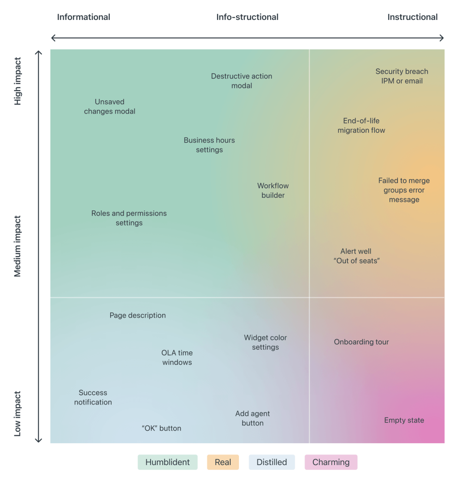

Voice is your personality, and tone is your attitude. Voice never changes, but the tone should adapt to the situation.

People care less about news updates, social feed updates, announcements, new features, crash reports, promotional and automated messages in general. Most importantly, a message from another human being is always valued much higher than any automated notification.

So notifications can be different, and different notifications are perceived differently; however, the more personal, relevant, and timely notifications are, the higher engagement we should expect.

3. Start Sending Notifications Slowly But Steadily

It’s not uncommon to sign up, only to realize a few moments later that the inbox is filling up with all kinds of irrelevant, and rarely actionable, messages. That’s exactly the wrong thing to do. A study by Facebook showed that sending fewer notifications improves user satisfaction and long-term usage of a product.

Initially, once the notification rate was reduced, there was indeed a loss of traffic, but it has “gradually recovered over time”, and after an extended period, it had fully recovered and even turned out to be a gain.

Sending fewer notifications can improve user satisfaction and long-term usage of a product.

A good starting point is to set up a slow default notification frequency for different types of customers. As the customer keeps using the interface, we could ask them to decide on the kind of notifications they’d prefer and their frequency.

Send notifications slowly, and over time slowly increase and/or decrease the number of notifications per type of a customer. This might work much better for our retention rates.

4. Don’t Rely On Generic Defaults: Set Up Notification Modes

Typically users can opt in and opt out from every single type of notification in their settings. In general, it’s a good idea, but it can also be very overwhelming — and not necessarily clear as of how important each notification is. Alternatively, we could provide predefined recommended options, perhaps with a “calm mode” (low frequency), a “regular mode” (medium frequency), and a “power-user mode” (high frequency).

How Slack decides to send a notification. It's not as easy as it might sound.

As time passes, the format of notifications might need adjustments as well. Rather than having notifications sent one by one as events occur, users could choose a “summary mode,” with all notifications grouped into a single standalone message delivered at a particular time each day or every week.

That’s one of the settings that Slack provides when it comes to notifications; in fact, the system adapts the frequency of notifications over time, too. Initially, as Slack channels can be quite silent, the system sends notifications for every posted message. As activities become more frequent, Slack recommends reducing the notification level so the user will be notified only when they are actually mentioned.

5. Make Notification Settings A Part Of Onboarding

We could also include frequency options in our onboarding design. A while back Basecamp, for example, has introduced “Always On” and “Work Can Wait” options as a part of their onboarding, so new customers can select if they wish to receive notifications as they occur (at any time), or choose specific time ranges and days when notifications can be sent.

[IMG]

Or, the other way around, we could ask users when they don’t want to be disturbed, and suspend notifications at that time. Not every customer wants to receive work-related notifications outside of business hours or on the weekend, even if their colleagues might be working extra hours on Friday night on the other side of the planet.

6. Allow Users To Snooze Or Pause Notifications

User’s context changes continuously. If you notice an unusual drop in engagement rate, or if you’re anticipating an unusually high volume of notifications coming up (a birthday, wedding anniversary, or election night, perhaps), consider providing an option to mute, snooze, or pause notifications, perhaps for the next 24 hours.

This might go very much against our intuition, as we might want to re-engage the customer if they’ve gone silent all of a sudden, or we might want to maximize their engagement when important events are happening. However, it’s easy to reach a point when a seemingly harmless notification will steer a customer away, long term.

[IMG]

Another option would be to suggest a change of medium used to consume notifications. Users tend to associate different levels of urgency with different channels of communication.

In-app notifications, push notifications, and text messages are considered to be much more intrusive than good ol’ email, so when frequency exceeds a certain threshold, you might want to nudge users towards a switch from push notifications to daily email summaries.

7. Track The Usage Of Notifications

Usually notifications aren’t sent for the sheer purpose of informing customers about an occurring or upcoming event. Good notifications are useful and actionable, helping both customers and businesses achieve their goals. For that, relevant metrics have first to be discovered and defined.

  • Do the wording, format, and frequency of notifications drive the desired action that we aim to achieve (be it social shares, time spent on the site, or purchases)?

  • What kind of notifications matter more than others?
  • Do the notifications actually bring users back to the application?
  • How much time passes between sending the notification and the user’s return to the site or app?
  • How much time is spent on average between the clickthrough of a notification and the user leaving the site?
[IMG]

Experiment with wording, length, dispatch times, and grouping and frequency of notifications for different levels of user involvement — beginner, regular user, and power user. For example, users tend to be more receptive to conversational messages that feel more casual and less like system notifications. Mentioning the names of actual human beings whose actions triggered a notification might be useful as well.

It’s never a bad idea to start sending notifications slowly to track their potential negative impact as well — be it opt-outs or app uninstalls. By sending a group of notifications to a small group first, you still have a chance to “adjust or cancel any detrimental notification campaigns before it’s too late,” as Nick Babich remarks in “What Makes A Good Notification”.

All these efforts have the same goal in mind: avoiding significant disruption and preventing notifications fatigue for our customers, while informing them about what they want to know at about the time they need to know it. However, if cookie prompts are just annoying, and frequent notifications are merely a disturbance, when it comes to the security of personal data and how it’s managed, customers tend to have much more pressing concerns.

Wrapping Up

As always in design, timing matters, and so do timely notifications. Start slowly, and evolve your notification frequency depending on how exactly a user actually uses the product. For every type of user, set up notification profiles — frequent users, infrequent users, one-week-experience users, one-month-experience users etc.

Allow your users to snooze and mute notifications for a while, and eventually you might even want to suggest a change of medium used to consume notifications.

Notifications are here to help users be notified when it matters, but they shouldn’t be annoying and disruptive when it doesn’t. Finding that balance will require quite a bit of experimentation and testing, but sending fewer notifications is usually a pretty good idea.

Content design: How to write any error message

Mike's Notes

Another article was published on Medium about dealing with error messages.

Resources

References

  • Reference

Repository

  • Home > Ajabbi Research > Library >
  • Home > Handbook > 

Last Updated

18/05/2025

Content design: How to write any error message

By: Rhiannon Jones
Deliveroo Design on Medium: 16/07/2018

This is the story of how I became a little bit of an error message nerd - and how you could become one, too. One of us, one of us.

From Chrome’s “Aw, Snap!” or “He’s dead, Jim!” to GitHub’s famous 404, error messages are one of the ways we content designers make our own fun. But when they’re bad, they’re very bad – and when you have a lot to manage, rewriting them all can seem like a Herculean task.

When I joined Deliveroo last year, our error messages were an inherited part of a fast-moving, fast-growing product. They’d never been given much attention — written by a raft of different people, from engineers to product designers, at different times, in different ways. They were often a little confusing, created for scenarios that were out of date. The tone was regularly off-kilter, too. Abrupt when it should be warm, over-familiar when it should be calm.

This is no rare phenomenon. In fact, it’s been that way at almost every product or organisation I’ve encountered.

But error messages are structural necessities. They’re the nuts, bolts, sticky tape and blu-tack of content design. When they don’t do their job, everything else you’re trying to build falls down.

As a newly minted, enthusiastic content design team, we were gripped with a desire to shake the dust off these forgotten corners of the product. Build a clear, usable, appropriate and consistent experience. And make sure that when we fail, we fail gracefully.

So we rewrote every error message in our customer product. Here’s how we did it.

1. Classify your errors

This step involved spreadsheeting, screenshotting and colour coding. If you just craned forward and started rubbing your hands together — hello, friend.

The right tone for an error message depends on how the reader is actually feeling. A good proxy for this is how much time they’ve spent on the task so far. Have they only just opened the app? Or have they chosen what to order, entered card details, typed out a delivery address? Is the problem something they can actually fix? How much will it impact their experience?

With this in mind, we catalogued and then categorised errors in two ways:

System — failures on the part of the system. They include service outages, items sold out or orders declined.

User — generated by user error, such as an incorrect card number or delivery address, lack of internet connection.

Then, they’re classified by:

Partial — a failure that only affects part of the system, and won’t completely stop users from completing their journey. Say a user wants to order food from their favourite restaurant, but they find it’s closed. Although frustrating, they can still complete their journey by ordering from another restaurant, so this is a partial error.

Total — a failure that completely removes the user’s ability to finish a journey. This would include 500 errors or severe outages.

We audited all of our error messages, with the help of our engineers, until we had every existing error screenshotted, tagged, each scenario described and classified as System or User, and colour coded with Partial or Total.

Once you’ve finished this step, you’re 80% of the way there!

2. Grade them by impact

A simple way to do this is to plot all of your errors on a graph. One axis describes whether they’re Total, Partial, System or User. The other describes how much impact each error has.

We decided on three levels of severity – ‘Annoying’, ‘Enraging’ and ‘Totally horrific’.


3. Define an approach

Once you have your errors mapped, you can start to see natural groupings. From there, you can define a common approach for all the errors in that group.

We did it like this:

Annoying

  1. Explain
  2. Add warmth

Make the problem easy to understand. Balance the user’s annoyance with warmth — maybe a joke, if that’s right for your product. A touch of reassurance, something light. Adding a little flash of humanity helps avoid robo-speak and keeps the interaction positive.


A hypothetical example of an Annoying message — Explain, Add warmth

Enraging

  1. Explain
  2. Instruct

Make the problem easy to understand. Give the user clear instructions to combat ambiguity (and anxiety) about what happens next.

A hypothetical example of an Enraging error – Explain, Instruct

Totally horrific — system error only

  1. Apologise
  2. Resolve

When necessary, give an unqualified apology. Owning the problem makes the apology more genuine. Make it clear we’re working to resolve it as best we can.


A hypothetical example of a Totally Horrific error – Apologise, Resolve.

Using a framework like this makes the writing and review process faster and more reliable. It means your whole content team can nail consistency more easily, too. And it lifts the quality of the final content.

The new error messages haven’t been released, so you won’t see them in your Deliveroo app just yet.

We won’t measure the impact of the new messages in any hard sense, because they’re simple improvements — we don’t expect them to move the needle in any significant way. But we will look for them to help our overall user experience become more grown-up, more solid and more stable.

When life gives you lemons, write better error messages

Mike's Notes

I found this article on Medium, which gives me somewhere to start on getting the Content Management System to store and generate Error Messages.

Resources

References

  • Reference

Repository

  • Home > Ajabbi Research > Library >
  • Home > Handbook > 

Last Updated

18/05/2025

When life gives you lemons, write better error messages

By: Jenni Nadler
Wix UX on Medium: 12/09/2022

When it comes to error handling, it truly is a team sport

Error messages are part of our daily lives online. Every time a server is down or we don’t have internet, or we forget to add some info in a form, we get an error message. “Something went wrong” is the classic. But what went wrong? What happened? And, most importantly, how can I fix it?

We encounter error messages all the time, but how often do they actually help us understand what went wrong and how to fix it?

About a year ago at Wix, we abruptly realized that, too often, we were not giving users the answers to these questions. When we got this wake-up call, we felt compelled to act swiftly, and not just to address the one error message that woke us up.

Welcome, folks, to Errorgate 2021.

Or, that time we changed thousands of error messages across Wix in just a month.

To complete this effort, we first had to define for ourselves what counted as a bad error message and what counted as a good error message.

What makes a bad error message

This is an example of a bad error message. It uses an inappropriate tone, passes the blame, speaks in technical jargon and is too generic.

Inappropriate tone: Imagine a doctor performing a procedure and then suddenly saying “Oops! Something went wrong…” That is the last thing anyone wants to hear when the stakes are high, whether it’s surgery or someone’s source of income. That is not the time to be cutesy or fluffy. We want to show the users that we know it’s serious and we understand it’s important to them.

Technical jargon: Even in today’s world of user-centered design, technical jargon still sneaks its way into error messages. You couldn’t fetch my data? My credentials were denied? What? The technical stuff is not important to the user, they just want to know what went wrong and how to fix it.

Passing the blame: Try to focus on the problem, rather than the action that led to the problem. We don’t want to shame users, even if something they did is why they’re seeing a certain error message.

We also made the decision not to pass blame on to third parties because it makes us look unprofessional, even if it would have taken some of the burden off of Wix. The user came to Wix as a trusted platform; they don’t want to think about other platforms. While we can say something like, “We’re having trouble connecting to ___”, we wouldn’t say something like, “___ isn’t responding right now.”

Generic for no reason: Sometimes we don’t know what caused the error… but sometimes we do. If we know what caused it and we’re not telling them, we’re doing our users the ultimate disservice.

What makes a good error message

An error pop-up demonstrating a good error message with each section highlighted to show why it’s better than the bad example. “Unable to connect your account (explains what happened). Your changes were saved (provides reassurance), but we could not connect account due to a technical issue on our end (explains also why the error happened). Please try connecting again (displays empathy and helps the user fix the issue). If the issue keeps happening, contact Customer Care (gives the user a way out


This is an example of a good error message. It explains what happened and why, provides reassurance, is empathetic, helps the user fix the issue and gives the user a way out.

Say what happened and why: Make it super clear what did or didn’t happen. This can be done with a combination of visuals and text. Explain why the user got this error, even if the only explanation is that there was a technical issue. At Wix, we made the decision to say “an issue on our end” if we have the space, to really reiterate that it’s not the user’s fault.

Provide reassurance: Where possible, let them know what was not affected by the error. For example, were their changes still saved as a draft, even though their email wasn’t sent?

Be empathetic: While we don’t want to be overly apologetic, we decided that we did still want to use “please” if the situation warrants it. Maybe it’s a really dire situation, or it’s something that we absolutely can’t help the user solve. In that case, we might use “please” to empathize even more.

Help them fix it: Tell them exactly what to do if there’s a way to possibly fix it. Short on space? Send them to a knowledge base article with a descriptive link like, “Learn how to resolve this” or “How do I fix this?”

Always give a way out: If they can’t fix the problem, or if it’s possible the issue could keep happening, provide them with a way to contact Customer Care.

Now that we had defined what makes a good or a bad error message, we had to start getting rid of the bad ones.

How we tackled removing bad error messages

We did a search in our content management system and found that there were 7,643 keys with the word “error” in the key or value. That’s 7,643 pieces of content that–at the very least–needed to be reviewed.

The task seemed monumental.

But we did it. We reviewed every single piece of content related to errors and decided if it was relevant for this effort. Once we had a list of all the errors we considered “generic” or “not helpful”, we sent everything to developers.

This was just one of the Monday.com boards that we used to categorize every single piece of content related to errors. Boards like these helped us set priorities, due dates and keep all disciplines in the loop.

Developers went message by message and mapped where each was being triggered in the code. They looked at what was causing the message to show, how frequently it was occurring, and what could be done to resolve the issue.

Based on that error mapping, the product managers, UX designers, and writers sat down and came up with solutions. We started by transferring everything from a spreadsheet to a Monday board, where we could easily track the status of things and what needed to be done. Sometimes, it was just a simple content change. In other cases, it required brand new error messages. And in lots of other instances, there was additional development work that needed to be done to fix things behind the scenes.

Then, we prioritized which errors to work on first. To set priorities, we focused on how often the error was happening and if it blocked the user from completing the flow. After that, we set milestones of one to four weeks, so that things didn’t fall by the wayside.

What we learned

There’s a difference between generic and unclear messages. While there were certainly a lot of generic “Something went wrong” messages, there were also a lot of unclear messages. These are just as bad as generic messages, and deserve the same amount of attention.

A generic message next to an unclear message. Generic message: “Something went wrong and this action could not be completed.” Unclear message: “Make sure you allow the requested permissions and try again.”

An example of a generic message compared to a message that is unclear. In the generic message, we’re simply not telling the user anything other than something went wrong. In the unclear message, we tried to explain what went wrong, but it used confusing language.

It’s not a content issue most of the time. Avishai Abrahami, our CEO and the reason this project got started, put it best in his email to all employees. “Generic errors are the result of bad development and product. … We must all care about it together.”

Truly everyone in Wix had to come together across all disciplines to fix these messages. Developers had to investigate and map. Product managers had to prioritize and create tasks. Designers had to provide new designs for new flows. And we, the UX writers, had to write and rewrite thousands of error messages.

We should be asking more questions. It used to be really common for a developer to say to us, “Hey, we need a generic error message here. Can you add one?” And we would say yes, thinking it would be a fallback or rare message. We didn’t often stop to ask questions like, “Why are users seeing this?” and “What is happening in the background?”

We missed a learning opportunity. Unfortunately, we were reactive instead of proactive here. If this effort had been strategically planned, it could have been an amazing learning opportunity for junior writers in particular. Instead, we were scrambling to write and rewrite messages without much strategic thought.

We were being a bad friend. At Wix, we have the mantra, “Write it like you’re talking to a friend.” We really believe in empathizing with the user, and being a friend with them throughout their process. But it turns out that we were more like that friend who loves to gossip, but doesn’t pick up the phone when life gets hard. That is not the friend we want to be, so we had to really dig deep and admit that we weren’t doing the best we could.

When we work together, we build better products. It’s cheesy, but it’s true.

What we’ve changed in our process

Established a cross-functional team to focus on error handling. This team is made up of senior product managers, frontend and backend developers, UX designers and UX writers. Their goal is to make sure proper error handling is part of the product life cycle, not an afterthought.

View it as a shared responsibility. Everyone is responsible for making sure we’re handling errors properly. Product managers are expected to place more emphasis on errors and edge cases, not just happy flows. Developers are expected to investigate and document errors according to platformized guidelines. Data scientists are expected to do better analysis on errors so we can track the events properly.

Review errors one month after launch. Sometimes, especially if it’s a brand new product, we don’t even know what errors to expect. So we might have to launch with generic errors, but now we have a procedure where we review the errors occurring one month after launch. This allows us to see what really are the biggest errors and write content specifically for those.

Ongoing review process. As writers, we know everything can always be optimized. So we’re constantly reviewing our errors, even the ones we just updated recently.

UX writers are empowered to challenge generic errors. In case a product manager or developer ever says, “Let’s just use this generic error message in all cases”, we now have the power to say no. The CEO of the company has said generic errors are not acceptable, so we’re not going to write them without more investigation and understanding of the problem. The power lies with us!

All in all, we changed thousands of error messages by working together with our colleagues. It was hard work and we all had a drink or two at the end of it. But it was the right thing to do for our users, and the only way to truly live up to our value of putting the user first.

Edited by Dan Raz. Graphics by Yansou Girard.