Breaking down enterprise UX design

Mike's Notes

An article I found on LinkedIn.

Resources

References

  • Reference

Repository

  • Home > Ajabbi Research > Library >
  • Home > Handbook > 

Last Updated

18/05/2025

Breaking down enterprise UX design

By: Stuart Silverstein
UX Collective: 23/04/2020

Enterprise Applications, the discipline of Enterprise UX, and where the differences are between Enterprise and Consumer and how to approach the complexity.

Customer care team

The term “Enterprise UX” is a hot term. It returns about 53 million results on Google now. The fact is, that after many years of working on Consumer applications, businesses are starting to see the ROI that companies achieve by investing in the internal applications that their employees use to conduct business.

I remember asking a former boss about whether a tool was an “Enterprise class” application, and her response was “Enterprise class just means ugly and hard to use.” While I laughed at her response, the hard truth is at the time, she was right.

While that was back in 2012, many Enterprise applications are still ugly and hard to use, because of the complexity, the age of the applications, lack of global perspective, and ad hoc requests. Historically, Enterprise implementations have been disjointed and cluttered, and hard to use, in addition to the “ugly” factor, which not only contributes to an increase in “eyesores” (MY EYES!!!!), but also cause legibility, scanning and comprehension mistakes that are often more costly to fix than to get right. As a result there has been a renaissance in Enterprise UX with several companies doing an awesome job of creating great Enterprise design, such as Salesforce, Intuit, and Microsoft.

These applications are often very process and business rule heavy, and often require a ton of flexibility and customization features. This is typically in contrast to a typical “Consumer” app, where consumers expect to have a simple intuitive experience for the lions share of the features. This means the Consumer side applications are skewed toward the first use, not the 1,000th, whereas he Enterprise app needs to be prioritized for repetitive use, and geared towards a user who will inevitably be a subject matter expert, well versed in prioritizing their workflow and understanding of the application architecture for goal completion.

In addition, Enterprise applications will almost always have a Service Design component. A person uses the software in the service of his/her job in order to accomplish a specific task with which the technology assists.

Some examples:

  • A Customer Service rep needs to access orders in order to see where the order is at, and then needs to place a note on the order for the production team.
  • An Inventory Management team is managing the inventory and communicating with the order team when products run out.
  • Sales team member needs to track sales, follow up with leads, and keep track of his pipeline.
  • A Project Manager needs to see what tasks are assigned, who is working on what, communication on the tasks, and the progress towards completion.

These are all services, where the technology facilitates views of the status and data within the system, notifies people within the system of jobs to be done, and automates some of the work—essentially, monitoring, data entry and reporting functions for the end user.

Another part of the applications are the large data sets. Enterprise applications are often working with 10x the amount of data that a customer actually sees. For example, a customer might see their name, address, telephone, email as part of their record, whereby the users of the Enterprise system can see those basic demographics in addition to clicks, pages visited, lifetime value, projected sales, etc. The customer needs very little information in comparison to the Enterprise user, plus Enterprise users need to be able to see and manipulate all the data behind the scenes. Also, when they cannot fix the issue themselves, they need an efficient way to let a team member know what to do… at scale.

These data sets, typically housed in a central database, are pooled from multiple applications within the platform. Within this data, as an Enterprise UX designer, we are tasked with making sense of all of this for the various user groups. There are various data objects (User, Order, Item, Communications, etc) with relationships to one another. A Customer may be the central object in our system, but has contact information, email communication, sales, etc, which are attached to that customer object.

Each of the objects come with “attributes” — such as address, city, state, cell phone, etc — that have historically been developed and formatted to match the business rules and system architecture, versus the humans at the end of that data. As a result, it is up to the designer, to make sense of all the business data, and make sense of it back to a user, in an organization that makes sense to them, and displayed at a time in their flow that they need it. Without clarified relationships of objects, applications can become messy very quickly. With the advent of big data, and systems that are able to house every click and interaction, the amount of data we have becomes very daunting to the average human to digest.

Plus, an Enterprise worker has 10x the amount of functions that a consumer app has, and has to integrate toolset, processes and information seamlessly. The result can be very complex and hard to use to the best of users — leading to poor job satisfaction, increased error rates, and lost efficiency and productivity at the very least—if not well thought through and executed. At the worst, it can cripple organizations from scaling their business.

As a result, organizations are now taking the user experience of internal applications very seriously and applying traditionally consumer focused methodologies, such as a user centered design approach to determine feature/function priority and look and feel.

What skills do you need to design for Enterprise Apps?

For sake of argument in this article set, I am going to assume you know how to do “Consumer UX design”— you understand how to research and identify needs, create prototypes to test, and develop thorough solutions for development. There are several great treatises on those subjects, so I will avoid them.

These skills will be foundational to the techniques discussed further. If you are not familiar with design, development and research, I would start there. This is definitely an advanced topic, as it builds on foundational UX domain knowledge — in addition to the fundamentals of User Experience design.

An Enterprise UX designer will need deeper competency in:

1) Interactive Design/Prototyping (including Research and Analysis)

2) Information Architecture

3) Service Design, Ecosystem and Service Blueprinting

4) Business Rules and Requirements or working with a Business Analyst (BA) if you have one.

While number 1 and 2 are part of a UX designer’s T-shape toolkit, 3 & 4 may require some additional experience. Even if you have experience in all 4, there will be some new ways you will need to figure out how to use them together. The interaction design will be much more complex, prototyping state based prototypes with inputs that pass data and variables, telling a story in your prototype in order to test it. This means Invision, Principle, Figma, Sketch etc may be insufficient for handling the job alone, if those are your primary tools.

I‘ve done Enterprise projects in Invision that have over hundred screens for a singular flow and if someone made a mistake, I had to reset the test and I think hurts feedback without the input data and variables to see where users get hung up on inputting information. In my experience, there are better tools for collecting usability feedback (aside from a concept test—which I will get to in upcoming articles).

In addition, these apps can require an advanced grasp on Information Architecture. This does not mean simply the organization of articles and content, but also organizing the data objects and attributes. In order to visualize how all this data works together, it will be helpful to make concept models of how all the data objects relate to one another. Then you can put them back together in a way that makes sense for the tasks and the user group. This is often one of the critical steps in organizing information in a way that makes sense and is digestible. Once you have a concept of how objects relate, you can make sure it aligns with the users and their needs. By making sense of the data objects in a model, it becomes easier to reconstruct them according to the users mental model.

In terms of Service Design, being able to visualize services in operations flows to see how the application will help to see how the technology integrates with the service. User Journeys work in a very similar fashion to Service Blueprints, however, a User Journey is for one user and through the lens of the user and the Service Blueprint is through the lens of the organization. This allows us to understand the needs of the system and make it work for more efficiently, not just the singular user. When working at the organization level, seeing how the whole service comes together, helps you better understand all the requirements, and the effect of your design decisions, and how the different user types might use the same flow.

System flow

This leads to point number 4 which is being able to document these business requirements visually in enough detail to design a solution. Most projects I have been on have a Business System Analyst (BA or BSA) on your project. You will both be working together on this, but the BA will be the owner of the requirements, and your tightest collaborator, working on features and analysis of the system.

Designing Flexibly vs Tailor Made:

Modules can be placed in multiple places

Often when we are designing for a consumer flow, we design a tailor made solution for a particular group, anticipating every need. When you get into Enterprise, you need to think flexibly because the amount of work it will take to create unique solutions for every user group. In addition, if you are working on a SAAS or cloud product, you need to accommodate for all different types of implementations and customizations that each organization will want to make. Different people need different permission levels within a product necessitating varying access to functions in an application. In addition, the flow of tasks is often fluid and changing, and often in different order. Systems like Microsoft Fluent Design System and Salesforce Lightning are designed flexibly to be used in any context and can be applied by an administrator without dev help.

Designing modules and components that can work in multiple contexts, will make it easier to add and manage the module in the system. For instance, a communication module — which shows all the emails, texts and communication with a customer — may be used at a customer level, an order level or a user level. Developing flexible modules decreases level of effort, and increases reusability and consistency. Modules in an Enterprise system typically take a bit longer to develop in Enterprise due to the complex nature, so if you make it as reusable as possible, it will save time and development effort in the long run, just like any design system.

The challenge then becomes figuring out where in a nonlinear flow a user may need entry into the particular task they are trying to satisfy. I like to think of it like the difference between a categorical taxonomy and a tag system. A categorical taxonomy implies that an item lives in one place, and is organized by drilling down to the item. A tag based taxonomy implies that an item has multiple facets and can be accessed from multiple avenues. Think more like “tags,” less like “categories.”

So we think of quick micro tasks that make up a larger task, and add entry points. For instance, if a customer service rep is looking up a customer name, looking at their history, reading notes, and then creating a ticket and sending an inquiry. This is all one “task,” but there are several “micro tasks” that you can evaluate a design for one by one once you have identified where the issue lies.

Access to the micro tasks are key. You may have the same button multiple times in various places, and it is cluttering and duplicating the action, and you may be right. But in Enterprise apps, due to the multiple entry points might make sense to approach it this way even if it does seem like duplication. Users in Enterprise apps often need to be able to enter a workflow from various points because their workflows are variable.

Different types of Enterprise applications

With all of this “Enterprise” information, there are different types of Enterprise projects, and they all have different needs. If you are working on a SAAS or cloud application, it will be implemented by a company, and thus will need a great deal of flexibility in implementation. An internal CRM will have a 360 view of a customer linking to other internal systems to all the central data.

As a common thread, we will stick with the definition of:

“A complex piece of software with lots of data, various distinct user groups, and several non-linear complex tasks that workers use to get work done.”

This covers all types of Enterprise applications, both internal and 3rd party. SAAS and Cloud products, CRM’s, Enterprise platforms, Analytics packages, Accounting Software, Email programs, and the like. As a result, there are set “classifications” that the average Enterprise will have.

While this is no means an exhaustive list, these are some of standard ones I have run across in my travels. Many of these apps are platforms that cover multiple categories, however, for this exercise, I have simplified them based on function and main class of the application. This is a mix of SMB and Enterprise Apps. For simplification, I am including both, because the SMB apps are usually more “consumer like” and can provide inspiration for a better experience.

These applications may be:

• Internal : Applications developed internally

• Purchased : Purchased software or SAAS product

• Customized : Off-the-shelf apps which have a different or modified

presentation layer.

• Combination : part Purchased, part Customized, part Internal

Examples of typical classes of Enterprise applications:

CRM (Customer relationship manager) — houses all information on a customer, primarily used by Sales and Customer Care teams to understand customer context and history. Typically in integrated with communication, ticketing, reporting and/or marketing platforms.

Examples: Pipedrive, Sugar CRM, Insightly, FreshSales

CRM application screens

CRM apps Pipedrive, Insightly, and Freshsales. All have some sort of customer page, a pipeline and reporting capabilities and integrate with other systems.

ERP (Enterprise Relationship Program) : These are large complex platforms that incorporate elements of all the different applications into a singular suite in order to customize an implementation and have all the pieces integrated. Modern ERP’s have a complete set of modules and a design patterns, which you can leverage to create solutions quickly.

Examples: Microsoft Dynamics, Salesforce Lightning, NetSuite, Zoho, SAP

CMS (Content Management Systems) : A system for publishing content or creating HTML pages or emails. typically used by content and marketing teams to publish content on the web, applications and social media.

Examples: SharePoint, Drupal, WordPress

Calendar and Scheduling : Apps that show you when events are, and often the ability to schedule one or multiple people.

Examples: Calendly, Time Trade, GCal

Analytics/Reporting : These apps can be Sales, Behavior Tracking, Reporting or visualizing any type of data. They are typically used by the entire organization, but will have different views depending on the user type — For example a view for the product team with details, and a view for Executives with less.

Examples: Tableau, Google Analytics

Productivity Suite : These apps are very straightforward — the swiss army knife that allows any user to create content for work — Word docs, Spreadsheets, etc. Typically integrates with communication for sharing.

Examples: Office 365, Airtable, G-Suite

Accounting/Invoicing : These applications are for keeping track of sales and orders. There are typically more specialized software the Accounting team will use to keep track of sales and money, especially for tax purposes, but this can be used by all parties to track the details of a sale.

Examples: Xero, Quickbooks, NetSuite, Acumatica

Support/Ticketing : These are for tracking defects in a system. This can be a Support application — whereby Customer Care Reps enter tickets to keep track of customer errors, or a bug reporting system, and/or tech support. They often have “cases” or tickets as a central object in their system, which are issues that need resolution, which are assigned to people to solve.

Examples: Zendesk, Jira

E-Commerce : Applications that allow companies to create inventory, sell products and often run reports. May also integrate with a POS system.

Examples: Magento, SAP Hybris, Shopify

Intranet/Wiki : Applications that companies use as a hub for all employees to find other team members, communicate with others, find out policies and benefits and access other software.

Examples: Sharepoint, Confluence, Igloo

POS (Point of Sale): Think of this as a complex cash register. Employees at a physical location ring up items — can be food or retail purchases — and then take payment.

Examples: Swift POS, SquareUp, Vend

Communication : These apps are to communicate internally or externally and have many different forms — chat, email, messaging, etc. They all have some sort of “thread” and someone is able to send a message and notify another user of the message where that user can send a response.

Examples: Slack, Email, Text, Facebook Messenger, LiveChat, Intercom

Project Management : A list of tasks and status of a “project.” This can mean anything. When I worked in the Real Estate space, and we considered a home sale a “project” — whereby you had documents that needed to be completed within a period of time, and we needed to track the progress towards done. If it has tasks, deadlines, scheduling, and a goal — it’s a project.

Examples: Asana, Wrike, Monday, Microsoft Project, Trello

Automation: These applications can be anything whereby the user creates an automation, and then is able to monitor and get reporting on the system. This can be a marketing automation or a process automation or data transfer. If you can create a custom flow and have the computer do all the work then it is an automation software project.

Examples: ServiceNow, Salesforce Marketing Cloud, Autopilot

System Monitoring: These are software that lets a person see how a system is behaving in order for them to make adjustments. This could be an airplane cockpit, a heartbeat monitor, a supply chain management or a telephony app. The idea is to let the human at the end see what is happening, and if there is a problem to make it known.

Specialty Apps: A specialty app is used by a specific group, for a very specific task. While specialty apps may combine a few of the above into a specific context, the difference here is that it is typically for a very technical specific audience, which has little or no need to communicate the details to the rest of the company. Think of your design software falling into this category. While there are ways to “export” the designs to be consumed, Photoshop is definitely geared toward the designer to get work done.

As you can see, these applications are combined together to create an “experience” and workflow for a worker. A sales person might use the CRM to keep track of his/her leads and sales, but will use a Reporting modules to see sales and Communication modules to email information. On top of that, a salesperson is also doing these things in tandem to try and accomplish something bigger than the individual task. Furthermore, the salesperson is not going to get a specific “sales” CRM (although they do exist).

Each of those teams will have several people doing very different things with the data. A Customer Care rep will look at the customer information only to validate an identity and then look at orders, whereas a Salesperson will want to see when the customer’s birthday is in order to send a surprise. As thus, you often have several different groups which need to use the same application, often with different needs. However, we need a singular app or platform with views that accommodate each particular user need to mold to the task at the right time.

We need to balance the organization of information, action buttons, and pacing to match the needs of the user.

Another critical piece of information on these software pieces, is that often they are not purchased by the people who use them. So, if you are using a SAAS software the app needs to “look impressive” for the purchaser, and perform impressive to keep the team happy. The SAAS software also comes with the challenge of needing to be customizable for various types of users, which means that customization on these types of projects will be key, for sales, support and performance of the software.

Integration and the evaluation of the whole experience.

Now, the challenge becomes distilling this down to something digestible, but there is one more topic to cover: Integration. With Enterprise applications in particular, there needs to be integration points and consideration of the whole experience. As stated above, the Enterprise applications are very rarely used in isolation for a specific task, and more often than not are used in tandem.

Think about the Salesperson example above. We need to not only consider the application we are working on, but also how the network effect limits or prohibits productivity as a whole. If I am creating new orders, and my order system and my CRM are not connected, then I have segregated data, but I also duplicate the work by reentering the contact information. We want to be able to look at the entire experience to see how the tools interact with one another, so as not to create work silos that tank productivity and extensibility of the data.

When we are thinking of evaluation methods, we will want to be able to create artifacts to review the following in order to evaluate the experience:

1) User Journey and Context

  • User Flow
  • User Journey with error correction plans

2) Service Design and Operations Flow

  • Service Blueprint
  • Service Blueprint to show service and flow across the organization

3) Data Objects, Application Ecosystems and Relationships

  • Concept Model
  • Data concept model to demonstrate relationships of data objects

4) Task Analysis and Opportunities for consolidation

  • Task analysis
  • Task analysis across user groups

5) UI Flows and Usability

  • UI Flow
  • UI Flow for micro-task
  • UI screen

Break the experience down to the level of zoom

1) Organization/System level — The highest levels of the software. This will involve understanding all the different user groups at a high level, task analysis and prioritization across all user groups, and data analysis of high level objects.

2) User Level — This level involves breaking down a specific problem into its tasks, and understanding the issues that affect productivity. While you will need to understand data objects, in this case, they are typically a smaller set, and be able to organize the attribute level to organize the information. The journey of that particular flow and where there are problems within that journey are of greatest interest to pinpoint for deeper investigation, as well as the service pipeline that might affect your design.

3) Task/UI level: Analysis at these levels occur when there is an application that is up and running well, but needs to be fine tunes. This is going to be actual usability testing for a flow, combined with contextual understanding and interviews with the user(s).

Levels of Zoom : Organization, System, User, Task, UI

These levels are cumulative, and in order to get to UI level or execution level details, you will need to work your way down. For example, I was on a project, and my creative brief from my boss was “Salesforce… take a look at it.” Seeing as her request was very broad, and had very little detail, I had to start at the organization level, and work my way down, by starting with identifying the issues that were the biggest across all the user groups, then finding out which of the tasks needed to be improved. After that I was able to tackle the UI pieces that I was responsible for myself in execution. To get from organization to UI takes a few rounds of refinement, but due to the complexity of the system, it helps break it into digestible chunks.

When you are approaching a system, if it is too big to digest in one round of work, you will need to break it down. You need to get down to the tasks or goals for you to solve first before you can solve. This can be a little different than Consumer level design, whereby the tasks are often simpler and linear, and you are usually solving for less complex user types and needs. Enterprise apps typically have lots of business rules, and complex user types doing lots of different functions, and it takes time to understand those, and decide where to start, therefore, the approach really should be multi-level.

In my experience of working on an internal applications and customized applications in particular, I have often walked into an organization where systems has been devoid of UX for a long time — which means the system needs to be analyzed starting the organization level and worked down to UI. The Enterprise product and tech teams were fielding requests, and collecting business requirements, and problem solving with the business owner directly. This typically means “add this button here so I can do x while I am on this screen.”

As of 2018 survey by UX Pin of 3,157 UX, Product and Engineers, only 26% of teams have had a UX practice for more than 5 years. In this same survey, the no 1 problem teams were working on was consistency. This can be due to the historic nature of other disciplines owning UX in pieces, but not looking at the entire experience.

Enterprise software can be an exciting new challenge for those designing consumer apps who are looking for new challenges. Hopefully, this article has given you a place to start when you have to get a handle on a large app, and form a plan of attack on approach.

Heap Table in PostgreSQL

Mike's Notes

Some fascinating notes here about how the PostgreSQL database stores data. This information was prompted by an article in the Data Engineering Weekly

Resources

References

  • Reference

Repository

  • Home > Ajabbi Research > Library >
  • Home > Handbook > 

Last Updated

18/05/2025

Article

By: 
Quadcode: 20/04/2025


  • Data in Heap tables can be stored randomly on different pages and different places within the page. If you want to sort the data, use ORDER BY.

  • Each table has its own metadata with lots of information.
  • If the table is larger than a gigabyte, then Postgres begins to split it into separate files with a size of 1 gigabyte.
  • PostgreSQL uses a fixed page size, commonly 8 kB. The page structure simultaneously grows from top to bottom and from bottom to top.
  • Each page has a header, transaction pointers, a meta layer for each tuple and for each row.
  • The page has Fillfactor — the ability to store information only up to a certain level.
  • The object identifier is used only to generate the structure object number, but not for the content.

Notes from Drews Dev Blog

  • Loading a nice fresh Postgres install
  • Exploring the database folders
  • Let’s play with some data
  • Show me the files
  • What’s the heap?
  • So what’s a page?
  • Page layout
  • What happens when a row gets modifed or deleted?
  • What about indexes?
  • Why would I ever need to know any of this?
  • Further reading
  • Future topics
  • Updates
  • Footnotes

Should I Open Source my Company?

Mike's Notes

Article by Ant Wilson, CTO of Supabase.

Resources

References

  • Reference

Repository

  • Home > Ajabbi Research > Library >
  • Home > Handbook > 

Last Updated

18/05/2025

Should I Open Source my Company?

By: Ant Wilson
Supabase: 25/04/2022

Supabase has been open source from day one. This is one of the best decisions we've made. It didn't feel like a difficult decision at the time, since kiwicopple and I are long time users and advocates of great open projects like PostgreSQL, Python, Bitcoin, React, [... insert long list]. Open-sourcing Supabase ended up surprising us in many ways. Many people imagine that maintaining your business in public might be burdensome - but the opposite is true. There are many unexpected upsides that have made building Supabase - the product and the company - easier.

While some of this advice comes from our lens as a Dev Tools or PaaS company, most of it will apply to any software company.

When we discuss open source business models with other founders, there are three complaints that come up again and again. These are:

  • People might criticize my messy/bad/unfinished code
  • Hackers will find and exploit security holes
  • Competitors will steal my Intellectual Property

We'll cover each of these in detail and follow up with some of the surprising benefits we discovered building Supabase, namely how open source:

  • Solves your dev talent problem
  • Improves your product (massively)
  • Will carry us to Utopia

Let's dive in.

But my code is bad#

This is just ego. The person who spends the most time thinking about you is you, and the person who spends the most time stressing over your bad code is you as well. If someone else is spending time stressing over your bad or messy code, then it's likely you've hit upon something worth pursuing. The folk story of the Stone Soup applies here. If you share good ideas with the community they will adopt and improve on them with you. The community will help refactor and replace any bad code, and they might even introduce new code quality guidelines to your project, improving the process for everyone who comes after. Toxic community members who complain about bad code instead of making suggestions to improve it are not the people you want in your community anyway.

All open source contributors have a graveyard of old projects. What's cool about this is that people looking to build something similar have a library of ideas and approaches to learn from. They may take inspiration from your approach to certain problems. At the very least, they won't be wasting time making your same mistakes. Don't worry about old projects ruining your reputation. At best people will find them useful. At worse they won't get noticed anyway.

Getting to secure#

One of the biggest fears running a hosted solution where the code is publicly available is malicious actors will read your code, discover exploits, and hack your services. In our experience, Linus's law of "given enough eyeballs, all bugs are shallow" also applies to security issues. Since the very early days of Supabase we have had (often anonymous) security researchers active in our code and platform, helping us find potential issues. If you're offering a software as a service, make simple instructions available at /.well-known/security.txt to let the good guys know how to disclose potential issues to you.

The premier example of how open source projects can be more secure than proprietary code bases is Bitcoin. In his 2015 talk Andreas M. Antonopoulos describes how closed source banking systems have the software equivalent of weak immune systems, because huge security holes can be obfuscated for long periods of time, and when eventually exploited can have enormous detrimental effects. On the flip side of this is an open source protocol like Bitcoin, where any security holes are there for all to see. Exploits are found early and often, and then patched. Remember that successful software companies can take more than a decade to build. Over a long time period, open source systems will tend towards a more secure state over secretive, proprietary systems, especially in a time when hiring talented security engineers is extremely competitive.

Beating the competition#

In software ideas are cheap. Value is almost always created in execution of ideas. When you share your ideas with the world, it frees up your brain to focus on things that matter most. Instead of spending time worrying about which contractors or partners have access to your code base, you can focus on iterating faster. You'll probably be surprised how the open source community responds to your openness.

Grow a community of experts#

In order to build a successful company, you'll have to execute well and grow your customer base over a long period of time, let's say 10 years. In this Ultra Marathon, any advantages gained by competitors peeking at your code base are unlikely to be material over that 10 year period. It's likely that you'll have to iterate on, and refactor your code base many times over during that period. Building a team and a community that is the best in the world at iterating on your solution is how you will win in the long term.

Winning in the market#

If you're in a market with a huge (and growing) TAM, that is really worth pursuing, it's unlikely to be a winner takes all situation. The first lesson is to find a segment of users you can “wow” and then iterate like crazy. Every second you focus on your competitors is time you could be focused on improving your product or your team. If a competitor forks your open source project, and is able to out-ship you, then I would argue that you were bound to lose that particular race anyway.

On top of all this, IP and patents in software are notoriously difficult to enforce. It will save you time, money, and mental energy if you're not worrying about trying to protect your software ideas with lawyers. You can protect your business much better by becoming the best in the world at implementing your software ideas.

Late stage#

Once your project reaches significant scale, you might find yourself in a situation like Elastic, or Mongo, where large cloud providers are offering your product with a superior distribution model.

Firstly, if you're just starting out, the biggest problem facing you right now is getting to that point. If you become so successful that AWS is deciding to take resources away from one of it's many billion dollar product lines to compete with you in hosting your product, you're doing something very right.

Secondly, and more constructively, you should prepare for this eventuality by finding areas where you can outcompete anyone. Most cloud providers are notoriously bad at Developer Experience for example, so take advantage of that and make DX one of your core competencies. If after 6 years, Google tries to steal your lunch, you should have a brand, a team, and a community, that have spent the last few years preparing for a David versus Goliath-type fight. Make sure you're not blindsided by something like this by planning for it from the beginning. You have enough time and focus on your side to construct a winning strategy.

Stop worrying#

In general if a competitor is looking to you for ideas, then good luck to them. They'll always be a step behind you, and expending more energy than you are by worrying about their competition. Especially in the early stages, when resource is scarce.

Now that we've addressed some of the common objections, let's move on to some of the surprising benefits.

Hiring developers#

One of the biggest complaints of startups - no matter the size - is how hard it is to hire developers. Sourcing is hard, assessing developers is hard, convincing them of the quality of their future colleagues is hard. Being open source can solve your developer hiring problems!

Sourcing openly#

All developers benefit from open-source, and many developers look to pay those benefits forward by contributing to open source projects they find interesting. Maybe they contribute because of a good community, maybe they're trying to learn a new technology, or enjoy solving hard technical problems in new and novel codebases. If you lower the barriers to contribute code to your open source project, there's a good chance great developers will find your project. They might contribute in issue discussions, solve bugs, identify problems, or review PRs. Every contributor may not be open to work, but many will be attracted by the prospect of working on open source code as part of their full time gig. It's a huge advantage open source companies have over closed sourced ones. At Supabase we didn't start doing outbound recruitment until after we already hired 32 developers, and been operating for more than 2 years. Open source has been, and will continue to be, our primary source of finding new (and incredible) talent. Being a remote and async company, we find having an open source hiring strategy means candidates are self selecting for these skills, which makes our job of screening for them much easier.

No, I won't take home your take home test#

One of the biggest complaints developers make while looking for their next gig is having to solve LeetCode problems or do take-home tests in the interview process. They are time-consuming, arduous, and often don't represent the type of work they'll be doing on the job. However, if someone contributes to your repo you already have:

And the candidate gets to see all this from the company side as well! Does this team value code quality? Do they communicate effectively? Do they make good technical decisions?

People who have been hired at Supabase through our repos have made themselves indispensable. Many of them drove the development of existing repos, and even started new client libraries and SDKs. And not one of them were ever required to solve a LeetCode problem over Zoom.

But does it integrate with Excel?#

When building a startup, you might find that you only really have the time to solve your biggest problems. In order to move fast, you need to focus on what 80% of the user base is asking for. The features requested by the minority are prone to getting indefinitely shunted. When your systems are open source however, these users have the ability to contribute the features themselves, expanding the usefulness of your software - sometimes to new use cases that you didn't even know existed. This happens most often with integrations and adaptors. Users might want an Azure or Vercel integration, and if someone else can provide the development resources to make those connections, then everyone using your project benefits as a result.

It's 2022. Where are the flying cars?#

In a world with no open source, technology companies everywhere are re-inventing the wheel, on loop... forever. To combat this at Supabase, we don't just open source our new projects. We always try to support existing open source projects, before inventing new ones.

Think about each of the automotive companies today. Writing proprietary functions, to build proprietary UI elements, on proprietary windowing libraries, running inside proprietary operating systems, using proprietary drivers, to display an error message that you'll probably never see! What a waste of developer time and effort!

I won't evangelize too much here... I think this meme summarizes my feelings on the subject...

Protege Frames and OWL

Mike's Notes

There was a recent discussion on the Ontolog Forum about OWL and Protégé-Frames.

Resources

References

  • Reference

Repository

  • Home > Ajabbi Research > Library > Subscriptions > Ontolog Forum
  • Home > Handbook > 

Last Updated

18/05/2025

Protege Frames and OWL

By: 
Ontolog Forum: 15/09/2024

Mike is the inventor and architect of Pipi and the founder of Ajabbi.

words

Notification Design

Mike's Notes

Vitaly Friedman wrote Design Guidelines For Better Notifications UXa great article on LinkedIn. Reading this article and his references led me to design a database to store a notification taxonomy.

This notification database is now connected to the Design System within the Pipi Content Management System (CMS).

This provides a framework for configuring where, how, and what notifications should automatically appear in the application UI.

It could be worth experimenting to discover if automated testing by Feature Flags could somehow test the configuration of notifications. This could be a way to deal with the frequency issue discussed by Vitaly. 

Using feature flags could generate an initial bell-curve probability preference distribution. Combining frequency weighting and user notification preferences might reduce configuration complexity and point to a solution.

An extract of Vitaly's article is copied below.

Resources

References

  • Reference

Repository

  • Home > Ajabbi Research > Library >
  • Home > Handbook > 

Last Updated

18/05/2025

Design Guidelines For Better Notifications UX

By: Vitaly Friedman
Linkedin: 22/08/2024

Over the years, I’ve developed a habit to turn off all notifications once a year — both on mobile and on desktop. There are exceptions, of course, for the loved ones and friends, but most channels are put on the silent mode or mute mode until I eventually restore the ones that I really miss in the beginning of the year.

There is a good reason for it: high frequency of notifications. In usability testing, it’s the most common complaint, yet every app desperately tries to capture a glimpse of our attention, sending more and more notifications our way. Let’s see how we could make the experience around notifications slightly better.

1. The Many Faces of Notifications

Notifications are distractions by nature; they bring a user’s attention to a (potentially) significant event they aren’t aware of or might want to be reminded of. As such, they can be very helpful and relevant, providing assistance, and bringing structure and order to the daily routine. Until they are not.

Not every communication option is a notification. As Kim Salazar rightfully noted, status communication often relies on validation, status indicators and notifications. While they are often considered to be similar, they are actually quite different:

  • Indicators are passive and conditional. They don't require users to take action, but cue the user to something of note. Often as an icon, a flag, typographical variations, changed size or animation. They stand out to inform the user that there is something special that warrants their attention.

  • Validations are error messages that prompt users to take action clear the error. They are directly related to user’s input and often come along with an icon.

  • Notifications alert the user of a state of the process or a system. They are focused on external events but are not necessarily triggered by users’ immediate actions. They can be passive or require an action.

Notifications are informational messages that alert the user of general occurrences within a system.

In general, notifications can be either informational (calendar reminders, delay notifications, election night results) or encourage action (approve payment, install an update, confirm a friend request). They can stream from various sources, and can have various impact:

  • UI notifications appear as subtle cards in UIs as users interact with the web interface — as such, they are widely accepted and less invasive than some of their counterparts.
  • In-browser push notifications are more difficult to dismiss, and draw attention to themselves even if the user isn’t accessing the UI.
  • In-app notifications live within desktop and mobile apps, and can be as humble as UI notifications, but can take a more central role with messages pushed to the home screen or the notifications center.
  • OS notifications such as software updates or mobile carrier changes also get in the mix, often appearing together with a wide variety of notes, calendar updates, and everything in between.

  • Finally, notifications can find their way into email, SMS, and social messaging apps, coming from chatbots, recommendation systems, and actual humans.

You can see how notifications — given all their flavors and sources — could become overwhelming at some point. It’s not that we pay exactly the same amount of attention to every notification we receive, though. For the vast majority of users, it can take weeks until they eventually install a software update prompted by their OS notification, whereas it usually doesn’t take more than a few hours to confirm or decline a new LinkedIn or Facebook request.

2. Not Every Notification Is Equal

The level of attention users grant to notifications depends on their nature, or, more specifically, how and when notifications are triggered. People care more about new messages from close friends and relatives, bank transactions and important alerts, calendar notifications and any actionable and awaited confirmations or releases.

Not every notification is equal. Various notifications have various levels of severity, and require different levels of attention.

As Sara Vilas suggests, we can break down notification design across three levels of severity: high, medium, and low attention. And then, notification types need to be further defined by specific attributes on those three levels, whether they are alerts, warnings, confirmations, errors, success messages, or status indicators.

High-attention

  • Alerts (immediate attention required)
  • Errors (immediate action required)
  • Exceptions (system anomalies, something didn’t work)
  • Confirmations (potentially destructive actions that need user confirmation to proceed)

Medium-attention

  • Warnings (no immediate action required)
  • Acknowledgments (feedback on user actions)
  • Success messages

Low-attention

  • Informational messages (aka passive notifications, something is ready to view)
  • Badges (typically on icons, signifying something new since last interaction)
  • Status indicators (system feedback)

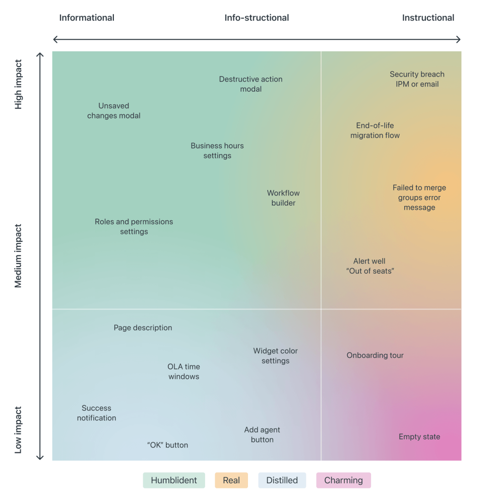
Taking it one step further, we can map the required attention against the type of messaging we are providing — very similar to Zendesk's mapping tone below, which plots impact against the type of messaging, and shows how the tone should adjust — becoming more humblident, real, distilled or charming.


Voice is your personality, and tone is your attitude. Voice never changes, but the tone should adapt to the situation.

People care less about news updates, social feed updates, announcements, new features, crash reports, promotional and automated messages in general. Most importantly, a message from another human being is always valued much higher than any automated notification.

So notifications can be different, and different notifications are perceived differently; however, the more personal, relevant, and timely notifications are, the higher engagement we should expect.

3. Start Sending Notifications Slowly But Steadily

It’s not uncommon to sign up, only to realize a few moments later that the inbox is filling up with all kinds of irrelevant, and rarely actionable, messages. That’s exactly the wrong thing to do. A study by Facebook showed that sending fewer notifications improves user satisfaction and long-term usage of a product.

Initially, once the notification rate was reduced, there was indeed a loss of traffic, but it has “gradually recovered over time”, and after an extended period, it had fully recovered and even turned out to be a gain.

Sending fewer notifications can improve user satisfaction and long-term usage of a product.

A good starting point is to set up a slow default notification frequency for different types of customers. As the customer keeps using the interface, we could ask them to decide on the kind of notifications they’d prefer and their frequency.

Send notifications slowly, and over time slowly increase and/or decrease the number of notifications per type of a customer. This might work much better for our retention rates.

4. Don’t Rely On Generic Defaults: Set Up Notification Modes

Typically users can opt in and opt out from every single type of notification in their settings. In general, it’s a good idea, but it can also be very overwhelming — and not necessarily clear as of how important each notification is. Alternatively, we could provide predefined recommended options, perhaps with a “calm mode” (low frequency), a “regular mode” (medium frequency), and a “power-user mode” (high frequency).

How Slack decides to send a notification. It's not as easy as it might sound.

As time passes, the format of notifications might need adjustments as well. Rather than having notifications sent one by one as events occur, users could choose a “summary mode,” with all notifications grouped into a single standalone message delivered at a particular time each day or every week.

That’s one of the settings that Slack provides when it comes to notifications; in fact, the system adapts the frequency of notifications over time, too. Initially, as Slack channels can be quite silent, the system sends notifications for every posted message. As activities become more frequent, Slack recommends reducing the notification level so the user will be notified only when they are actually mentioned.

5. Make Notification Settings A Part Of Onboarding

We could also include frequency options in our onboarding design. A while back Basecamp, for example, has introduced “Always On” and “Work Can Wait” options as a part of their onboarding, so new customers can select if they wish to receive notifications as they occur (at any time), or choose specific time ranges and days when notifications can be sent.

[IMG]

Or, the other way around, we could ask users when they don’t want to be disturbed, and suspend notifications at that time. Not every customer wants to receive work-related notifications outside of business hours or on the weekend, even if their colleagues might be working extra hours on Friday night on the other side of the planet.

6. Allow Users To Snooze Or Pause Notifications

User’s context changes continuously. If you notice an unusual drop in engagement rate, or if you’re anticipating an unusually high volume of notifications coming up (a birthday, wedding anniversary, or election night, perhaps), consider providing an option to mute, snooze, or pause notifications, perhaps for the next 24 hours.

This might go very much against our intuition, as we might want to re-engage the customer if they’ve gone silent all of a sudden, or we might want to maximize their engagement when important events are happening. However, it’s easy to reach a point when a seemingly harmless notification will steer a customer away, long term.

[IMG]

Another option would be to suggest a change of medium used to consume notifications. Users tend to associate different levels of urgency with different channels of communication.

In-app notifications, push notifications, and text messages are considered to be much more intrusive than good ol’ email, so when frequency exceeds a certain threshold, you might want to nudge users towards a switch from push notifications to daily email summaries.

7. Track The Usage Of Notifications

Usually notifications aren’t sent for the sheer purpose of informing customers about an occurring or upcoming event. Good notifications are useful and actionable, helping both customers and businesses achieve their goals. For that, relevant metrics have first to be discovered and defined.

  • Do the wording, format, and frequency of notifications drive the desired action that we aim to achieve (be it social shares, time spent on the site, or purchases)?

  • What kind of notifications matter more than others?
  • Do the notifications actually bring users back to the application?
  • How much time passes between sending the notification and the user’s return to the site or app?
  • How much time is spent on average between the clickthrough of a notification and the user leaving the site?
[IMG]

Experiment with wording, length, dispatch times, and grouping and frequency of notifications for different levels of user involvement — beginner, regular user, and power user. For example, users tend to be more receptive to conversational messages that feel more casual and less like system notifications. Mentioning the names of actual human beings whose actions triggered a notification might be useful as well.

It’s never a bad idea to start sending notifications slowly to track their potential negative impact as well — be it opt-outs or app uninstalls. By sending a group of notifications to a small group first, you still have a chance to “adjust or cancel any detrimental notification campaigns before it’s too late,” as Nick Babich remarks in “What Makes A Good Notification”.

All these efforts have the same goal in mind: avoiding significant disruption and preventing notifications fatigue for our customers, while informing them about what they want to know at about the time they need to know it. However, if cookie prompts are just annoying, and frequent notifications are merely a disturbance, when it comes to the security of personal data and how it’s managed, customers tend to have much more pressing concerns.

Wrapping Up

As always in design, timing matters, and so do timely notifications. Start slowly, and evolve your notification frequency depending on how exactly a user actually uses the product. For every type of user, set up notification profiles — frequent users, infrequent users, one-week-experience users, one-month-experience users etc.

Allow your users to snooze and mute notifications for a while, and eventually you might even want to suggest a change of medium used to consume notifications.

Notifications are here to help users be notified when it matters, but they shouldn’t be annoying and disruptive when it doesn’t. Finding that balance will require quite a bit of experimentation and testing, but sending fewer notifications is usually a pretty good idea.

Content design: How to write any error message

Mike's Notes

Another article was published on Medium about dealing with error messages.

Resources

References

  • Reference

Repository

  • Home > Ajabbi Research > Library >
  • Home > Handbook > 

Last Updated

18/05/2025

Content design: How to write any error message

By: Rhiannon Jones
Deliveroo Design on Medium: 16/07/2018

This is the story of how I became a little bit of an error message nerd - and how you could become one, too. One of us, one of us.

From Chrome’s “Aw, Snap!” or “He’s dead, Jim!” to GitHub’s famous 404, error messages are one of the ways we content designers make our own fun. But when they’re bad, they’re very bad – and when you have a lot to manage, rewriting them all can seem like a Herculean task.

When I joined Deliveroo last year, our error messages were an inherited part of a fast-moving, fast-growing product. They’d never been given much attention — written by a raft of different people, from engineers to product designers, at different times, in different ways. They were often a little confusing, created for scenarios that were out of date. The tone was regularly off-kilter, too. Abrupt when it should be warm, over-familiar when it should be calm.

This is no rare phenomenon. In fact, it’s been that way at almost every product or organisation I’ve encountered.

But error messages are structural necessities. They’re the nuts, bolts, sticky tape and blu-tack of content design. When they don’t do their job, everything else you’re trying to build falls down.

As a newly minted, enthusiastic content design team, we were gripped with a desire to shake the dust off these forgotten corners of the product. Build a clear, usable, appropriate and consistent experience. And make sure that when we fail, we fail gracefully.

So we rewrote every error message in our customer product. Here’s how we did it.

1. Classify your errors

This step involved spreadsheeting, screenshotting and colour coding. If you just craned forward and started rubbing your hands together — hello, friend.

The right tone for an error message depends on how the reader is actually feeling. A good proxy for this is how much time they’ve spent on the task so far. Have they only just opened the app? Or have they chosen what to order, entered card details, typed out a delivery address? Is the problem something they can actually fix? How much will it impact their experience?

With this in mind, we catalogued and then categorised errors in two ways:

System — failures on the part of the system. They include service outages, items sold out or orders declined.

User — generated by user error, such as an incorrect card number or delivery address, lack of internet connection.

Then, they’re classified by:

Partial — a failure that only affects part of the system, and won’t completely stop users from completing their journey. Say a user wants to order food from their favourite restaurant, but they find it’s closed. Although frustrating, they can still complete their journey by ordering from another restaurant, so this is a partial error.

Total — a failure that completely removes the user’s ability to finish a journey. This would include 500 errors or severe outages.

We audited all of our error messages, with the help of our engineers, until we had every existing error screenshotted, tagged, each scenario described and classified as System or User, and colour coded with Partial or Total.

Once you’ve finished this step, you’re 80% of the way there!

2. Grade them by impact

A simple way to do this is to plot all of your errors on a graph. One axis describes whether they’re Total, Partial, System or User. The other describes how much impact each error has.

We decided on three levels of severity – ‘Annoying’, ‘Enraging’ and ‘Totally horrific’.


3. Define an approach

Once you have your errors mapped, you can start to see natural groupings. From there, you can define a common approach for all the errors in that group.

We did it like this:

Annoying

  1. Explain
  2. Add warmth

Make the problem easy to understand. Balance the user’s annoyance with warmth — maybe a joke, if that’s right for your product. A touch of reassurance, something light. Adding a little flash of humanity helps avoid robo-speak and keeps the interaction positive.


A hypothetical example of an Annoying message — Explain, Add warmth

Enraging

  1. Explain
  2. Instruct

Make the problem easy to understand. Give the user clear instructions to combat ambiguity (and anxiety) about what happens next.

A hypothetical example of an Enraging error – Explain, Instruct

Totally horrific — system error only

  1. Apologise
  2. Resolve

When necessary, give an unqualified apology. Owning the problem makes the apology more genuine. Make it clear we’re working to resolve it as best we can.


A hypothetical example of a Totally Horrific error – Apologise, Resolve.

Using a framework like this makes the writing and review process faster and more reliable. It means your whole content team can nail consistency more easily, too. And it lifts the quality of the final content.

The new error messages haven’t been released, so you won’t see them in your Deliveroo app just yet.

We won’t measure the impact of the new messages in any hard sense, because they’re simple improvements — we don’t expect them to move the needle in any significant way. But we will look for them to help our overall user experience become more grown-up, more solid and more stable.

Ontology Summit 2007 Framework Session

Mike's Notes

A recent discussion at the Ontology Forum involving Dr Denise Bedford. Very useful. I need to add more notes.

Resources

References

  • Reference

Repository

  • Home > Ajabbi Research > Library >
  • Home > Handbook > 

Last Updated

18/04/2025

Ontology Summit 2007 Framework Session

By: 
Ontolog Forum: 2007

This session will be devoted to the discussion and finalization of a "Framework" that can be applied to help the broader community understand the distinctions between Ontology, Taxonomy, Folksonomy and all the terms in between that various communities employ to label those "ontologies" or "structures."